Painting Color and Light for illustrators and artists: contest part 2

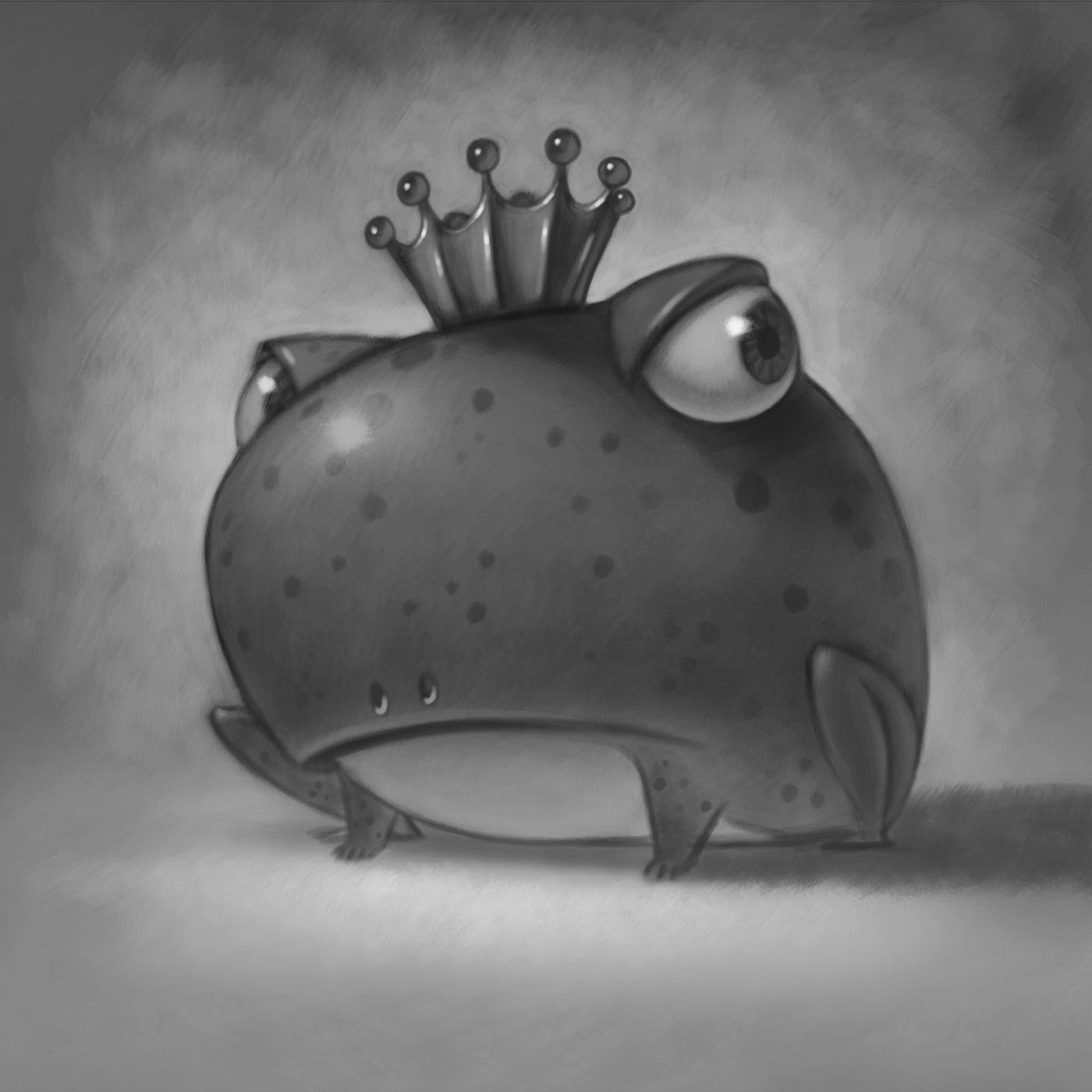
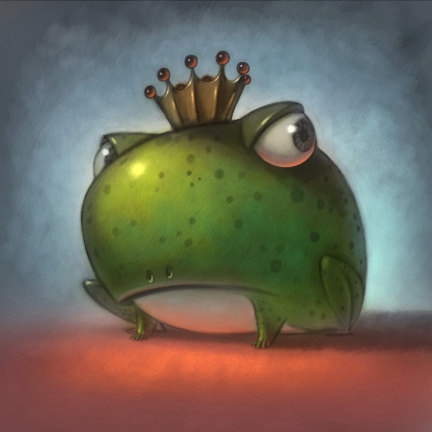
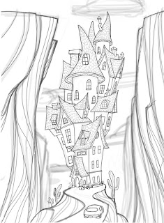
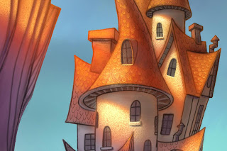
Start with a good drawing.

There’s still time, to do the Coloring contest, see post

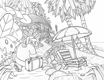
It seldom works to start with a bad design and then just fix it with color. Good light and color will look better with a well designed drawing.

It would be nice to give you all the answers but I think I’ll give you all the questions, that way you can come up with the answers.

Things to consider for your artwork

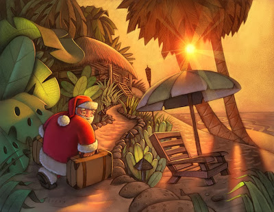
Light and Shadow What is value and how is it used?

What are gradients and how do they work in a drawing?

Can drawings work in mostly light values, dark values, both?

Lighting shapes, What direction should my light be coming from?

How does light fall on a sphere, cube, cylinder, & human form?

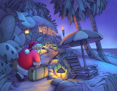
What is the relationship between the darkest dark and lightest light?

Why is reflected light important to show form?

What are cast shadows and what happens to their edges?

What direction do shadows go?

What are occlusion shadows?

Painting Color, What colors should I buy or use?

Are white and black colors?

Should you ever use black?

What happens when you mix various colors?

What are cold & warm colors?

What is a vibrating color?

What are color opposites?

What’s the difference between primary, secondary, and tertiary colors?

What are tints, shades, and gradients?

What is a triad?

How can you neutralize two colors?

What’s is a complimentary color scheme and an analogous color scheme?

How can I get rich color in my painting?

Where can I learn to draw and paint better?

How can I enter the little coloring art contest for artists and illustrators everywhere?

You can’t just fix a bad design with good color

If it don’t work in Black and White, it ain’t gonna work in color. 

A good painting will also look good in Black and White. That is to say, if you can’t work out your value patterns in black and white, you won’t be able to just fix it with color. Have you ever heard of a grisaille, (that was a tough one to sound out, let alone spell) It’s a black and white under painting. I think the word gray, or grey, as I like to spell it, comes from the same root.

What is a Grisaille and how do you pronounce that?

Grisaille (/ɡrɨˈz/ or /ɡrɨˈzl/French: gris [ɡʁizaj] ‘grey’) (Giz-eye is how I pronounce it) is a term for painting executed entirely in monochrome or near-monochrome, usually in shades of grey. ~Wikipedia 

Work out your lights and darks before you add color

So, where was I? Ho yeah, it is often wise, especially for beginners, to work out you lights and darks before you move to color. I like to give it the squint test. Squint at your work and see if it reads well. Do the wrong things disappear? Do the right things stand out?
The under painting can be in a sepia or other tone too, for a nice effect, it doesn’t have to be BLACK and White.

Light and Shadow

Where is your light source? Is it in the picture? If so, you shouldn’t have anything in the painting that is brighter than the light source.

Are the shadows, cast, core etc, in the right places? I am thinking that the cast shadow in this piece is not dark enough.

Do you have reflected light in the right places?

Just add Color, or Colour as my UK friends like to spell it.

If you are painting digitally, like in Photoshop or on the iPad, you will enjoy the ability to undo. If you are using water colors then you can just glaze transperant colors over you black and white under-painting. AKA Grisaille.

If you are using oil paints, you may want to try a water color, acrylic, or gwash, (i better look that up) Gouache. The oil paint goes right over the aqueous paints without disturbing them and it works really well. You should see how Robert Barrett uses gouache, for under-paintings to create a beautiful effect. He calls it a “Rub-out” technique.


Working with Color

PHOTOSHOP PLUG IN DOES THE WORK FOR YOU

New Photoshop Tool Makes Painting TOO Easy to Believe

Christmas Card

I know we don’t usually post on a Tuesday but this is a special occasion that can’t wait. This new plugin is SO usefool, You would have to be a fool not to look at this new Photoshop tool. Some wonder if computers are going to make it too easy. We will have to compete with every fool out there that can afford a PC and Photoshop.

Watch this short Demo video while Mr. Folio Academy, Will Terry shows you how easily he just painted this beautiful digital creation of Santa Claus on a snow board.


You probably want to know where you can get this cool plug in and how much it’s going to cost. They say that the right tools don’t make you an artist but I am starting to think that this is all I need. I am so greatfool for this new plug in. The cool thing is, the company that created this affordable plug in is working on another one that is equally helpfool. It does most of the drawing for you. It will be released 04/01/2015 a year from today. Happy april fool’s day.

Comments welcome.

“SKELETON FOR DINNER” Coming Soon!

“Skeleton For Dinner” Is Finished!

Picture of Sample Page from "Skeleton for Dinner" art by Will Terry

I just finished the last illustration in my new book – “Skeleton for Dinner” by Margery Cuyler. It’s due out sometime before Halloween this next fall. I’ll definitely post links when it’s in stores. I had so much fun with this one! I love coming up with unique characters and Halloween?! Are you kidding me? I’ve always wanted to do a Halloween book!

I was really happy that my editors were OK with the idea of making “ghost” into a little girl instead of the typical predictable cartoonish ghost we’ve seen a million times. It was fun to render a character that doesn’t follow the same color rules that other objects follow. Skeleton was fun to design too because I felt he/she needed to be cute and not too scary.

After most of the paintings were finished I looked at skeleton and realized he/she just didn’t look cute enough without eyes. This was one of those decisions that of course didn’t make any sense academically – obviously a skeleton doesn’t have eye balls but for a children’s book character I questioned if he/she should have them. I contacted my editors and they thought about it too. In the end we all felt good about eye balls. Eye balls are a good thing. :)

I’m still in search of the perfectly illustrated picture book. I poured my heart and soul into this one. There are a few things I would change or explore a little further if given the chance – but I’m glad this one isn’t perfect. Wouldn’t it be scary to bowl or pitch a perfect game?…knowing the only direction is down from there?


Painting with Cool and Warm Colors

Warm Light, Cool Shadows add to a beautiful Contrast

a Will Terry Digital Painting of House type Castle

I painted this as a demo for my digital painting class this semester at UVU. I really wanted to play around with a dramatic lighting situation.

Photograph of Red Rock cliffs with Harsh Light and Shadow.

Get inspiration from the real world.

One of the reasons I’m a big advocate of getting out there and seeing the world with your own eyes is the feeling you get and the inspiration to find a place for it in your work. I woke up to this last year in Utah’s Goblin Valley last year Needless to say, I was inspired.  – my tent was about 5 feet to the right.

Rough Sketch of House/Castle on iPad

So this is how I begin my sketches on my iPad.

I call this the ugly stage. I’m basically making a “map” for me to trace and perfect on another layer. At this point I don’t care about detail – just the raw elements and proportions. It’s sketchy and loose but it will serve as my guide.

Pic of ProCreate Logo

Use “Procreate” for a larger file size, plus you can rotate your “paper”

I’m using “Procreate” now because I can have a much larger file size then “Brushes”  – AND – I can rotate the “paper”. That’s a huge improvement. Down side: (why is there always a downside?) It’s much slower than brushes. I’ll be making an update video for my “Painting on the iPad” video tutorial that demonstrates how you can use Procreate for your workflow.

drawing of House/Castle

And this is the perfected sketch. I probably used about three more layers to get to this point reducing the brush size and increasing the value of my lines.

House/castle digital painting in process

I think it’s really neat to look at this part of the painting because it looks so dark and different than the part in the sunlight…similar to the photo I took. I added the color in Photoshop CS5.

digital paining of House/Castle in process

I love light and shadow.

You really can’t have one without the other can you? I really like exploring with cool colors vs warm colors to see what interesting blends happen and the mood it creates.