QUICK Tree House SKETCH Pencil & Photoshop

Pencil Sketch of a Tree House, Painted in Photoshop

Push yourself by giving yourself a time limit. 

The world famous artist, Will Terry, (he’s famous in my world) sketched this little tree house during a really boring meeting. I know I know, all meetings are boring to Will. To me too. But this one was really boring. Lucky he had his sketch book.

tree House Sketch

He only gave himself a half hour paint it. 

He liked the sketch and decided to scan it and paint it using Photoshop, but only gave himself a half hour to color it.
He wanted to push himself and see how far he could get in a short amount of time.
I feel it could look better, and would if he spent more time on it. But rules are rules. Sometimes it is a good exercise to push yourself by giving yourself a time limit.

Work the whole Illustration from general to specific

tree House 30 Mins. in PS

A lot of artists will work their illustrations from general to specific. When asked how they know when it is done, they might say. “It is done when it is due.” In other words they keep working on it, bringing the whole painting up to a finished point little by little. Working the whole thing from general to specific. So as they spend more time on it the whole piece gets more and more refined. Then when the dead line comes, turn it in, it’s done.
This tree house is still pretty general, but for some things it could almost pass as being finished.
It is time for this blog post to be finished so I…

Scanning, Re-Sizing, Resolution, & Pixels in Photoshop

Getting the size and resolution right in Photoshop

This is mostly for beginners but a valid subject.

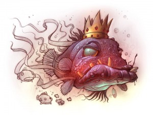
Scan your art or sketch and work in Photoshop to finish, paint or add color.

For those who sketch or start their artwork on paper but like to work in Photoshop

This is a question that we still get a LOT, so we want to address it.

Step by Step 

Scan your sketch or artwork into Photoshop at 150-300 pixels per inch.

Make sure Constrain Proportions is checked

Make sure Resample image is checked.

Set your pixels per inch to 300 pixels per inch.

Decide what size you want the printed piece to be and set your size. I.E. 8”x10”

There are a few things to be aware of when sizing a piece in Photoshop.

Get your Height, Width and Resolution right.

Get it into Photoshop and go to image then image size and just look at it.

Go down to Resolution in the Document Size area and see what you’ve got. If it says 150 pixels per inch, then that is how many pixels equals 1 inch in the resolution of your painting. Above the RESOLUTION there are the two Width and Height boxes, you want those in inches not pixels, so change that if you need.

Above that there are the Pixel Dimensions, this is the total number of pixels, not pixels per inch but per the entire piece. Set your width and Height to Pixels.

Make sure Scale to Style, Constrain Proportions and Re-sample Image are all checked. Like so.

Pixel Dimensions

Width      [big number]           Pixels

Height     [big number]           Pixels

Document Size

Width         [     8.5     ]            Inches

Height        [    11       ]            Inches

Resolution  [    300     ]          Pixels/Inch (Pixels per Inch)

[ x ] Scale Style

[ x ] Constrain Proportions

[ x ] Resample Image

Printers and publishers usually want everything to be at 300 pixels per inch.

They also want it to be so many inches, like 8×10″ for example.

You want your illustrations to look good. So…

Increasing the Resolution does not increase your resolution.


Set the parameters and get the scale right in Photoshop

Now that you are working on your sketch in Photoshop, you want to set the parameters and get the scale right.

Screen resolutions is about 72 dpi, (Dots Per Inch, or Pixels Per Inch)

There is nothing you can do to increase the actual information that you have. If you take a small picture scanned in at say 75 DPI and blow it up, it won’t give you ANY more detail. Like a projector, if you back it up and make the image on the wall bigger, the image will not be any more clear, just bigger. So Ideally, when you work, you want your finished piece to be big and clear, you can always make it smaller. Don’t go too big it takes longer for your computer to render.

If you have an 8×10 piece scanned in at 150 and you just change your Resolution to 300, it doesn’t actually change the resolution of your work and leave all the other parameters the same. It will decrease the size of your piece.

The reason I set my scanner at 150 instead of 300 is because I don’t need too much detail to go from a sketch to a finished piece, so I scan it in at 150 then change it to 300, then I work in 300 dpi so my finished piece will be acceptable for the printers, and it will have the detail and clarity that it needs for the size that it will be printed.

So you want your width to be the right size for the printer, say 8 by 10”.

You want your resolution to be 300.

Now you can zoom in on your work and zoom out without changing the end size or resolution.

Make sure Constrain Proportions is checked. 

[ x ] Constrain Proportions wants to be checked so that if you change the width, the height will change proportionally and vise versa. If you want the width wider but want the height to stay the same, if you just change the width, it will skew your art, so it would be better to keep your proportions, so you should just size it bigger and cut some off.


MAKE SURE resample image IS CHECKED.

[ x ] Resample Image is important so that if you change your work from 150 pixels per inch to 300, it will boost your actual pixels per inch as well. Otherwise, with Resample image unchecked, you could change your work from 150 to 300 Pixels per inch and  size of your work will drop to compensate for the change. Now when you go to ship that finished work to the printer, your 8 by 10” piece will be more like 4 by 5”, and that is not good. You Cannot just make it bigger with out making it all pixilated and blurry and crappy.

What a publisher wants

Most publishers want your work to be at least 100% of what they want to printed piece to be. 8-9” by 10-11” and at 300 pixels per inch.

 Have fun with it, explore. 

Fool around with some of these and see what happens to your image and the other perameters when you make changes with Constrain Proportions and Resample image checked and unchecked.

The danger is that you can be working along and not realize that your pixels per inch or your resolution or your document size is way too small until you are finished. And that is a painful lesson. Ouch!


for more info on this same thing, watch this video by Will Terry.

Submitting and sizing your art for children’s book publishing

Know about SCBWI. Society of Children’s Book Writers and Illustrators.

If you are new to publishing Female artist at drawing boardand you want to get into it. And you don’t know much about it but you are willing to learn… “So you want to be a children’s author or book illustrator?” You really should look into SCBWI, Society of Children’s Book Writers and Illustrators

http://www.scbwi.org/ It is the largest organization for children’s book writers and illustrators. It is a great connection for authors
and illustrators. If you are looking to do your own self publishing, they aren’t that helpful and they are just starting to get involved with e-publishing, but for the most part, SCBWI is the place to be if you are getting started or if you are already started in traditional publishing for picture book writers and illustrators. They have chapters in every major area in the US and they are abroad as well.

There are over 20,000 members, (I believe) and you should be a part of it for your own good. Just Google it for your area and start being a part of it and getting in touch with the group in your area and start attending their conferences and learning from them. That is the organization that you want to be a part of.

When it comes picture book illustrations, SIZE  MATTERS!

000 Stylus 05

What size or format should you create your art for submitting it to publishers.
If you are a writer illustrator or if you are just an illustrator and you want to submit some of your stuff to publishers to be considered, you may be asking yourself what size and shape should you make your artwork. I would say, follow standard guidelines. Your basic 8.5” x 11” format is fine. When you are hired or commissioned to do a book, the publisher will usually decide what proportion the book should be. Very few are square or odd shaped.

Don’t write and illustrate the whole book!

A lot of writer artists want to finish the whole book and submit that.
The publisher doesn’t care to receive the whole finished book, and that would be a waste of time and effort anyway. It doesn’t make any sense to fret over getting the whole thing right and perfected. They don’t want it all done, they would rather see a good “book dummy”. They have professional art directors and editors and people that know the science of making or helping that book succeed. So when they choose your book, they will want to set the parameters and THEN have you do what you do best, illustrate.
Many would say that there is a right way and a wrong way, but there are rarely any hard fast perfect, right way, rules. For example if you go to a SCBWI conference you may hear one editor say, “I prefer a mock up book in the mail” or “I like to get a PDF so I don’t have to worry about losing it or whatever, it’s quicker”, and others who like other stuff, etc”.

Put your best foot forward, Presentation matters.

Cow poke 7So you should make a book, DUMMY! I don’t mean to call you a dummy, I mean a “book dummy”. I may have said that there aren’t any right or wrong ways to submit your picture book but really there are a LOT of WRONG ways… For example, a sloppy demo would be a wrong way, presentation does matter. Let it show that you care, that you are creative. A nice, clean, clear presentation would be a RIGHT way. I personally like to use a PDF, It is fast, easy, clean, neat, accurate and inexpensive. If it gets lost in the (e)mail, send it again, it’s free and easy.
So send a book dummy with your sketches, and a few “finished” pieces. That way, they know what you are doing. They understand the idea and they can see from the one or two finished pieces convey your ability to paint and bring those sketches to a finished illustration.
Put your best foot foreword. You should spend some time on this mockup or book dummy, this is your sales pitch and it is a competitive world out there. You need to be willing to spend some time on that dummy so that it gets their attention and holds on to it.

Self Publishers should get the facts first.

For self publishers… Talk to the printer that you will be hiring, ask a few questions.
Paper costs money and it comes in certain sizes and when they print, there are better ways to lay it out to maximize your paper per book ratio. That is why there are tipically 32 pages long, it’s because they print it on the BIG paper, fold it, bind it and cut it. Multiples of four. So work with the printer to determine the best size and shape and number of pages so you can maximize your pages per dollar.

There is no Perfect answer to the size and lay out for apps and e-books question.

What about sizing for my apps and e-book? That is a GOOD question, the sad truth is, there is NO magic answer for that question. There are so many different sizes AND proportions for each different devise. So there will be extra space or you can stretch your image. All of these are bad solutions. So on one device the image will fit flush or a full bleed.

One universal solution could be to make your artwork big enough to crop for every other device BUT that will cost you a ton. That would be a programming night mare. You got kindle and nook, devised to be held vertically, not horizontal, not quite right for a picture book.

My advice would be to make it for the i-Pad.

The i-Pad is the nicest looking device and the most popular for digital picture books and apps. (at present) So it may be advantageous to just create for the i-Pad.

One more last plug for SCBWI.

You really should consider becoming a part of the SCBWI.

More SCBWI people are published than non SCBWI goers. If you were to poll 1000 people who attend SCBWI conference attenders who submit to publishers, and 1000 who don’t attend SCBWI, but submit, I believe you would discover that a lot more of the SCBWI goers are being chosen and published than the non SCBWI folk.
I feel like the artist’s rep is a dying bread. Because of the internet, and the immediacy and quick ability to look through your portfolio and see your style, the publisher and the artist, just doesn’t need the artist’s rep any more.
The Righter on the other hand, can still benefit by having an Agent, (the rep for the writer). The publisher can’t just glance through your work and get the jest of it where they can with your artwork.


Good luck and enjoy life. Relax, draw, paint, Life is good.


Drawing & Painting on iPad Demo using Procreate & Speed Painting

Artist Demo on iPad using Procreate and a Cheap Stylus

Working From General to Specific I start by Roughing it in

Rat with an Orange Peal Umbrella

Last week I mentioned that I “found the perfect Stylus” and I showed you a few steps and told you to work from general to specific, as I was taught by my friend and mentor, Robert Barrett. AKA Bob Barrett.

This was a little 2 hr drawing, of a Rat character that I did in Procreate. I had this Idea to draw a little rat that made made an umbrella out of an orange peal and a tooth pick.

Video below for Artists who hate to read

If you are like me and you don’t like to read. I get a lot of questions about my process so I thought I’d do a little demo, in fact if you scroll to the bottom you can just watch the video. It’s a speed painting but I talk it through.

Start your drawing by blocking in your sketch

000 Wet Rat 02 000 Wet Rat 03

I always start by blocking in the basic shapes. I’m on my iPad right here, if you saw last weeks post, you may remember that I use a real cheap Targus stylus pen, stylus that you can get for about $12.00 at Target or Walmart. I like the blunt tip, as I like to block in the basics to start.

But what about detail? Keep reading.

Add Detail with a blunt tip by Zooming In

000 Wet Rat 05 000 Wet Rat 06

What you won’t see in these pics or the video below, is that I am zooming in to add detail. If you get the basic shapes in first, you don’t need to worry about ruining it by adding detail too soon. Plus, zooming in to add eyelashes and fur and stuff and I am putting it in the right places as the basic shapes are there. So when I zoom in, I still know where I am.

Work the entire picture as you go for a constant look.

000 Wet Rat 07 000 Wet Rat 08
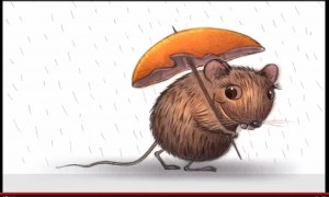
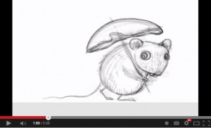
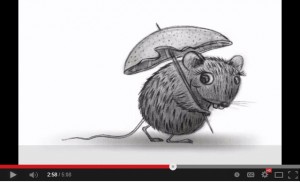
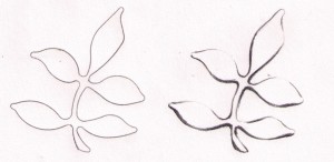
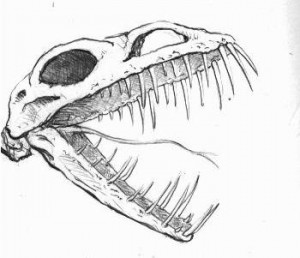
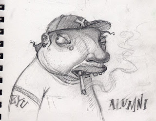
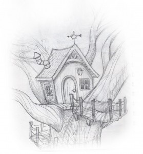
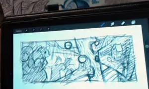
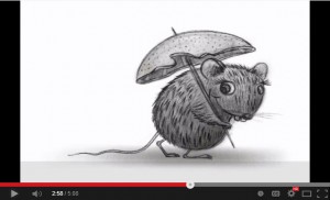
I don’t work one spot to completion but rather, I go over the entire picture over and over again. As I add fur, I do it all over then add a little more, then work something else, like more fur, shade etc. Bringing the entire sketch, slowly to a more finished look. Not staying in one place too long. This also helps you get a consistent feel throughout the entire painting. This way I am happy with it before I dive into the detail. General to specific I tell you. Bob knows his stuff.

I use a few layers but not a lot.

000 Wet Rat 09
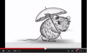
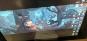
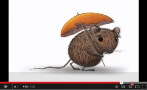
I used three or four layers on this drawing. Then I flatten them down. And maybe add another layer, so I can edit new stuff before I flatten it down again. I like to use a new layer when I start on another area. That way you can edit as you go. After I get the drawing complete, more or less, I can add color. Note how I add color to the whole piece 000 Wet Rat 01
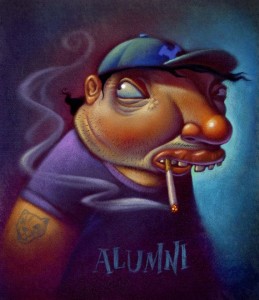
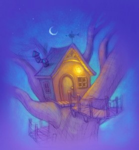
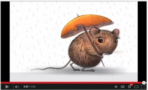
then move to some more color. Once the value and basic color is in place, I work some more color. Shadows and highlights.

This is not how I usually Paint, but… 

Warning! there will be a few adds here and links our website store. 

On my children’s books and bigger illustrations, I work differently. I might get started on my iPad then move it to my desk top and use my Cintiq monitor or Wacom tablet and Photoshop. I would add the color there and add the detail later. Probably because of the size of the full spread files and what not. I am finishing this one in Procreate for demo purposes. One of the cool things with Procreate is that you can export your video, going into tools while in your drawing, export it, like to Drop Box and it sends out a little MP4 file. There I can work faster, esp with the Cintiq monitor. Plus I can get the texture that I really want. I like the Progreate tools but I prefer the Cintiq monitor or Wacom tablet for adding the detail and color.

When I Illustrate Children’s Books, I Use my Cingiq Monitor.

If you want to see more on that, you can find tutorials on FolioAcademy. There are a lot of digital video courses, like for Photoshop, How to illustrate children’s books, how to design a drawing and a lot more. Here is where you can find my courses and you can also choose from a lot of other artist instructors.

iPad Speed painting Demo Video using Procreate & a cheap stylus


I Found the PERFECT Stylus For Drawing and Painting on iPad – Procreate App

Finaly! The Perfect Stylus For Doing Your Art on iPad

ARtist, Will Terry used to use His finger to create art on his iPad

Will Terry displays his favorite stylus

I use a fat bulbous stylus

I have found the perfect stylus for drawing and painting and doing all that digital artwork on my iPad. Using a Procreate drawing app. I used to use my finger, in Photoshop and in Procreate. As you know, the best stylus is the one you have with you and you should always have your fingers, or at least one of your fingers with
you. I have changed my mind since I’v found this. See the pictures.

How can this bulbous pointed thing be a good stylus?

000 Stylus 02
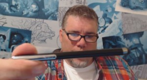
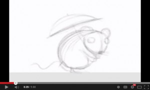
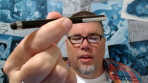
But when you draw with something blunt like this, you are less likely to get that into detail too soon. Like if you are painting, William Whitaker says you should go for the biggest brush you dare to use and then grab one a little bigger.
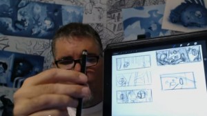
So with this bulbous, fat, blunt stylus, I just start drawing.

Artist Will Terry displays a few sketches on his iPad

See sketches there to the right.

I first come up with a few sketches, doing all my initial design for my images with the fat stylus right on my iPad or on my Cintiq monitor.


I turn my design into a composition.

Composition on an iPad

My Simple Composition

Just like when you paint in Photoshop, you want to start with huge clunky brushes. All the realy great Photoshop artists use a big brush in Photoshop.


Then Work the Composition into a Painting

Digital Painting by Will Terry

The comp there, became THIS Painting which I just finished on my cintiq monitor. You may remember it from a previous post. See it here on my Cintiq monitor as well.

000 Stylus 06So when you are painting, Start with a big brush and when you are painting digitally, start with a big stylus like the one I use now instead of my finger.


This Fish King Painting was done with the fat Stylus

King FishThis Fish King Painting was done with this stylus that I displayed above. You may remember it from a previous post.

You can spend over $100 on a stylus

I am asked here at FolioAcademy,  ALL THE TIME, Will, What stylus should I get? What is the best one for me? Which one are you using? Should I get the one that has a little plastic tip? Or one with pressure sensitivity or virtual pressure sensitivity. (I don’t know about that, because it may be for you if your painting style requires some of that, and that could be a good one).

OK it may not be the very best Stylus, but it’s the best for me. 

000 Stylus 08

OK I admit I said I found the best stylus but I have to admit that it may not be the best for you. It probably is, however, you may be light years ahead of me and using one of those artsy, schmancy, pressure sensitive, new fangled,  expensive, high falutin types.

For me, the $12.00, blunt tipped, stylus you can get at Target or the basic store. I think I spent $12.00 on mine. And if and when it wares out or gets lost, I am not out a whole lot of money.

 Paint and Draw from General to Specific, Digitally and Traditionally

So to recap, you should know this already but if you don’t, you should start rough, and work from general to specific. That was drilled into us at BYU by the Dean of the Illustration Department, Robert Barrett, and he was right. After you get your painting blocked in, or your drawing roughed in, then you can go in and start picking out, or putting in, the detail. So many paintings are ruined because the artist starts noodling it to death and working on detail when the basic shapes and design are still not worked out or defined. In a word, use a fat stylus.

I will post a demo next week of a sketch to a nearly finished piece.


Line Quality: Artists Use this Simple Tip for a Better Drawing

 Line Quality, the Thick and the Thin: Get in Line for better design

Through Thick and Thin, Let the Quality Begin

line quality

Before and After

To illustrate how Thick, and Thin Lines make a more Interesting Drawing, I just took a little plastic template with a few shapes to choose from and quickly traced out these little leaflets to the left here. The first one, on the left, I just drew with a consistent, uniform line and it reads as a leaf. But is a very basic drawing. The one on the right, I traced lightly with the same template and pencil. When I was done, I decided that the light source would be in the top right or up above and to the right. So I lightly erased a lot of the lines that would be bathed in light if the light were coming from the top right. Then I took a real pencil, a 6-B I think, and I darkened and thickened the lines in the areas that would be less likely to have direct light shining on them. The bottoms of the leaflets and to the left. This is a good little exercise especially for beginners.

Thick and Thin Lines Make a More Interesting Drawing

A sketch of two leaves, one with good lines and the other, plain.

After and Before

Here I took the same plastic template but traced a different pattern. The oak leaf. The one on the right, as you can guess, I just traced with a uniform line. Equal pressure, no thick no thin, just plain old line. Yes you can tell it is a leaf, you can tell it’s an oak leaf. That is, if your a boy scout or someone that knows what an oak leaf looks like. BUT… The one on the left, has a little more depth to it. A little, a lot more interesting to look at. It is more likely to make it to my moms refrigerator. Once again, I chose top right for my light direction, I softened the lines that would be lit, and then I darkened and thickened the bottom left-ish lines.
And as you can see, I shaded the leaf in and put a cast shadow under it to help lift it off the paper and give it some life.

I don’t always draw dinosaurs, but when I do, they’re happy. ~Bob Ross lol

I don’t think Bob ever said that, but it’s something he should have said. 

Line Quality Dino Skull

This little sketch has been in my sketch book for a long time and one of my children helped me a little bit while we were in Church. Well, to stay awake in church, I often get my sketch book out and doodle or sketch. I hope the congregation folk just think I’m taking copious notes.

“That Wayne Andreason brother sure gets into these sermons!”

Some times to keep my kids still-ish, they sketch too, but when they get board of that, I let them look through my sketch book. And sometimes they “help” by adding to my sketches. As you can see that the top of this skull has got some thick lines where they should be thins. Well, my excuse is that my daughter or son, started drawing over some of my lines. Especially on the brow and over the nose, otherwise the line quality still works with this drawing or sketch.

“That brother Wayne is long winded!”

Illustration Demo for BYU Art Students

Art Demonstration for an illustration Class at BYU

 I may offend them with a BYU alumni overweight, and smoking!

I was asked by Greg Newbold to do a demo in his illustration classes… so I racked my brain to come up with something that would be FUN but non-offensive to the students. Well not TOO offensive.

Behold! the sketch I came up with. Fun? Offensive? Art?

I really like this sketch and I’m going to paint it but I’m concerned that the student’s might not like that I’ve decided to portray a BYU alumni overweight. And as many of you know, they don’t smoke, so I am taking a little risk here. Not to worry, they may be Mormons but they aren’t that uptight.  :)

Finished, Acrylic paint over Photoshop printed background.

Six hours to paint it

BYU alumnusThis is the finish art demo: It was a lot of fun working on it and talking to students. I was happy that they thought it was funny… or at least, didn’t beat me up for poking fun. I worked on it in class for about 4 hours and spent an additional 2 at home with a few finishing touches.


Digital Stage, no lighter than 50% value.

This is the beginnings of my digital stage where I Scan in my sketch, take that into Photoshop and airbrush some smooth, basic colors and keep them kind of dark. My main concern is getting everything no lighter than about 50% value.

Using Photoshop I spent about 20 minutes laying in shadows and basic foundation colors. Then I printed it on watercolor paper. The next step in this method was to stipple a layer of acrylic gel medium over the print. I use a kind of short hair paint brush and a little Gel Medium at a time and stipple it onto the paper, giving it millions of little tiny peaks. Aka tooth. The gel drys clear so you can paint with acrylics right over it. Building up the lighter areas. And of course saving the highlights for last.


How to Break Out of a the “ARTIST’S BLOCK” Slump

Artist’s Block, Break Out of that Horrible Slump

What do you do to break out of a slump? Artists block…or whatever you want to call it……it’s got you, what do you do?

A Can’t Think of Anything to Draw!

We all get it and rather than just tell what I do, I am going to list a bunch of ideas and comments from other artists. So lets hear what they suggest and then you can decide what’s best for you.

I just rant and rave. And RAGE!


COMMENTS FROM A DOODLERS LINKED IN GROUP.

 Keith Kern • Get out and do something you love doing. Have an adventure, watch a cool movie or whatever it is you like to do.


JB [Jack] Hertz • Kind of depends on what the situation is. It is different if it is for a deadline. Nothing can kill creativity better than pressure to perform. Getting away and doing diversionary things doesn’t work as well for me as I find I tend to obsess on the fact that I can’t come up with anything. And there I am sitting in a movie thinking about not being able to come up with some idea rather than enjoying the movie!!

If I just feel like I have had the last idea i’ll ever have, I will just scribble on a piece of paper. Big swirls, and little tight ones. Then I stare at it for a while. It is amazing what you can see in that sort of thing. It can really get the juices flowing. Another technique I use is to just draw. Free your mind. draw eyes, or other body parts..or faces then I imagine what the faces are saying or doing. Also I try not to throw much of what I have done away whether it is good or not as I can look through this “morgue” and get stimulated as well.


Chuck P• That is very good advice Jack, doing simple little scribbles and doodles would at least get me doing something on paper. It might inspire something…..you never know. I obsess on my block also and that is probably why it is stumping me. I should also work on some faces and hands as well as those are the things I am not happy with in my own critique. I might just have to start a :sketch graveyard” as well…lol…maybe I can pull a doodle back from the dead into something significant!


JB [Jack] Hertz • Glad you found something useful. I am always happy to help. This is a tad off target, but I find ideas don’t always come at the moment you are trying to conjure them up. Some of my best have come just as I am waking up. I guess that’s when my mind is the least cluttered. They may come, however, any time and anywhere. At any rate, I always

try to have a note pad and pencil close by so I can write down any pearls I surely will forget ten minutes later. [ (Shhh it’s a secret). That’s really why there are napkins on tables in restaurants and bars] ©¿©


Our brains are really funny machines. It is impossible to understand why there are somethings we cannot get out of them, while others are gone in a flash..at least that is what happens between my ears.

Keith Kern • “Great ideas Jack”

Wayne Andreason • (that’s me) I say, work on something easy. It seams like you don’t want to draw or paint when you fear that it won’t turn out. A lot of accomplished artists have the same problem. They too fear that it won’t work. They will work on an easy area on something that is easy, not a face. Then as their Left Brain shuts off and the Right Brain engages, they get back into their groove.


Continue reading

PHOTOSHOP PLUG IN DOES THE WORK FOR YOU

New Photoshop Tool Makes Painting TOO Easy to Believe

Christmas Card

I know we don’t usually post on a Tuesday but this is a special occasion that can’t wait. This new plugin is SO usefool, You would have to be a fool not to look at this new Photoshop tool. Some wonder if computers are going to make it too easy. We will have to compete with every fool out there that can afford a PC and Photoshop.

Watch this short Demo video while Mr. Folio Academy, Will Terry shows you how easily he just painted this beautiful digital creation of Santa Claus on a snow board.


You probably want to know where you can get this cool plug in and how much it’s going to cost. They say that the right tools don’t make you an artist but I am starting to think that this is all I need. I am so greatfool for this new plug in. The cool thing is, the company that created this affordable plug in is working on another one that is equally helpfool. It does most of the drawing for you. It will be released 04/01/2015 a year from today. Happy april fool’s day.

Comments welcome.

FREE WEBINAR! 10 Step Digital Painting

FREE STEP BY STEP Digital Painting Webinar

 March 1, 2014 7:PM MST (mt. standard time)

Dragon Rider

You know that feeling you got when you were 5 and you got to run downstairs on Christmas morning to open presents? Not to diss on past memories but WOW – I have that feeling again! I’m so excited to be able to create a lesson and share it with people all over the world! Our last webanar “How To Draw Everything” by Jake Parker gathered 879 people from countries on just about every continent – I even saw someone named “Penguin7493″ so… (Okay, maybe that wasn’t his, or her, real name… but then again, maybe it was)

How to, Step by step, Digital Painting Process FREE!

My ten step, how to paint, digital painting course webinar is absolutely free. And the video we make of the webinar is not free, but you can get a $10 discount if you act smart, I mean fast. Anyway, we have another webinar coming up on March 1st at 7:00PM MST and this time it’s my turn to share my digital painting process. I’ve broken it down into 10 steps. You know that old saying? The one that I’m about to butcher – “eating an elephant is hard unless you eat him one step or spoonful at a time…” or whatever but you get the point. If you learn to do something methodically it can not only make the task seem easier but also give you results you can replicate, and really, that’s what’s important right?

You can also purchase the video with added perks. 

Dragon Rider 02
For those who decide to purchase the video recording of the webinar we’ve decided to throw in some extras this time (we’re learning). You’ll get 3 things: A PDF study guide with a verbal description of each of the 10 steps. A bonus video explaining in detail how to set up Photoshop to use the texture settings in the brush pallet and my FULL Photoshop painting with over 30 layers from sketch to finishing touches. This is a high res file over 300 mb  – my working file so you can deconstruct the Dragon Rider and see what she’s really made of. Don’t be dissapointed if you don’t find any bones or entrails. Use it as your own working file to replicate my layers if you want to. This is a great way to actually see how someone paints in Photoshop.
DragonRider 03I realize that many people will think I’m crazy for letting my artwork get out there to be used by anyone for any purpose. I think most artists get a little too attached to their work and subsequent self importance. In the end it was 25 hours having a blast doing exactly what I wanted. If someone makes T-shirts out of it in some other country good luck – send me a picture of all the cash – that’ll put a smile on my face! And send me a T-shirt while your at it. I take a size “pretty freaking big”.
Pre-Order the Video & save $10 – The Webinar is FREE
It is absolutely FREE to attend the webinar, but if you would like to pre-order the video, PDF, Bonus Video, and Dragon Rider Photoshop file, you’ll get a $10 discount using coupon code “10step10” – but this will expire the end of the day of March 1 – check out the details in our store.
DragonRider 04
So you need to get registered for this event in order to be sent your individual joining link from GoToWebanar – simply click here and follow the instructions! See you soon!