About Wayne

Wayne is one of the manager dudes at FolioAcademy.com, a site where anyone can learn to improve their artistic abilities with a growing compilation of video lessons from professional artists helping you with your craft by teaching you their secrets and techniques.

Could ART Have Saved Six Million Lives? Hitler Wanted to be an Artist?

What if Hitler Would Have Been an Artist instead of a Nazi?

Adolf HITLER started out as an innocent, lovable little boy.

Painting by Adolf Hitler127 years ago today, on April 20, 1889 a baby boy was born in  Austria-Hungary, a town on the border with Bavaria, Germany. He was the fourth of six children, his parents named him Adolf and the rest is history. Or is it? It’s hard to imagine Adolf Hitler as an innocent little boy playing in the yard with his five brothers and sisters.

Little Adolf was strong willed and refused to conform at school

Painting by Adolf HitlerHIs dad, Alois retired and moved to Lambach, where he farmed and kept bees. Hitlers dad was a bee keeper? So is mine. Hitler attended a nearby school. He was soon impressed with warfare after finding a picture book that his father had about the Franco-Prussian War. Hitler refused to conform to the strict discipline at school and this caused a lot of father-son conflict. When Hitler was eight he took singing lessons and sang in the church choir, he even considered becoming a priest. I wander how that would have changed what we know as history.

Tragedy hit the Hitler home, changing little Adolf for the worse. 

Painting by Adolf HitlerIn early 1900 his little brother Edmond died of the measles and that realy affected little ten year old Adolf. “He changed from a confident, outgoing, conscientious student to a morose, detached, sullen boy who constantly fought with his father and teachers.” ~wiki

Hitler’s dream was to be an ARTIST but dad won’t have it 

Painting by Adolf HitlerHis dad wouldn’t allow Adolf to go to a classical high school and become an artist. In fact he sent him to some other, more rigid  school and the young Hitler rebelled and did poorly, like so many artists do, but on purpose, hoping his father would see “what little progress I was making at the technical school he would let me devote myself to my dream“.

Painting by Adolf HitlerThree years later his dad died quite suddenly, Hitler’s grades got worse and his mom allowed him to leave that school.  Two years later, in 1905, Hitler passed a the final exam, he left the school without any ambitions for further education or clear plans for a career.

given the chance, he is Rejected by the Academy of Fine Arts… Twice

Portrait of Hitler during WW1From 1905, Hitler lived a bohemian life in Vienna, financed by orphan’s benefits and support from his mother. He worked as a casual laborer and eventually as a painter, selling watercolors. The Academy of Fine Arts Vienna rejected him twice, in 1907 and 1908, because of his “unfitness for painting“. The director recommended that Hitler study architecture, but he lacked the academic credentials. On 21 December 1907, his mother died at the age of 47. After the Academy’s second rejection, Hitler ran out of money. In 1909 he lived in a homeless shelter, and by 1910, he had settled into a house for poor working men on Meldemannstraße. ~Wiki

Follow your dream, & encourage your children to follow theirs

Painting by Adolf HitlerAt Folio Academy, we say, “follow your dream”. Well, if art is your dream, we really say “follow your dream”. I know so many artists who love what they do, who were often discouraged by other’s, from going into such a career. “You’ll starve!” “You won’t make any money until after you’re dead.” I am not a big advocate for college and university educations either. I know a lot of would be artists that may have done very well and loved life as an artist or professional illustrator had they not been “Kicked Out” of school for “unfitness for painting“.

What if…? Could Art Have Saved 6,000,000 Lives? 

Painting by Adolf HitlerWhat if poor little Adolf had a loving father who encouraged and nourished Hitler’s desire to be an artist and devote himself to his dream? What if The Academy of Fine Arts accepted him in 1907 or 1908, because they had room or they didn’t need to worry about their high academic standards? What if he would have had the internet and he was able to learn from other artists who didn’t care if he was fit for painting, and went on to be a happy, even semi successful artist?

There is good in everyone, even Adolf Hitler?

Portrait of Hitler

I am not saying that I love Hitler or that I condone any of his CRAZY and ruthless act. I believe he became an evil man. But I know he started out, innocent and pure, he was a lovable baby and a child, he was a brother who probably loved to play outside in the dirt with his siblings and little friends and his little brother Edmond. I believe there is good in everyone, even ADOLF HITLER. He liked to color and draw and water color. He wanted to be an artist, what’s wrong with that? but NO…

Was he one of those lefties made to be a righty?

He was right handed but… was he always right handed?  I wonder if he was one of those frustrated left handed kids who was forced to be right handed. No wonder he cracked.

Room for 1 More Piece by Adolf Hitler

Courtyard_of_the_Old_Residency_in_Munich_by_Adolf_Hitler

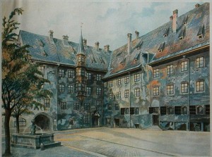
Courtyard of the Old Residency in Munich ~Adolf Hitler

P.S. Happy Easter.


ART SHOULD PLEASE THE SENSES

ART SHOULD PLEASE THE SENSES

Language like art, is a means to illustrate and get your point across. Think about it, art appeals to the senses, or grates on them. It’s all about pleasure and pain. Some artwork is painful to experience. Art can appeal through sound, smell, sight, taste and touch. Some things are more provocative than others, and some are more successful than others. A nice meal, a massage, a pleasant aroma, a beautiful painting, or music is ART.

It Hurts When Your Artwork Gets Scrapped!

This Illustration was Scrapped, but Not Forgotten

He DIDN’T MAKE THE CUT, SO HE WAS CUT.

This is the only fame this little guy is going to get, unless we post him on Pinterest.
Folio boy, Will Terry, created this little gem for a job he was working on for Klutz awhile back and this little guy just didn’t make the cut, so he was cut.

They can’t all be gems

But like on Facebook, if you have a million pictures of yourself or loved-one, or you cat, you probably don’t need to post all 1,000,000 of the pics, just post the good ones that get the point across. I know it’s sad when you have something that you work on and work on, our little babies they are, only to have them rejected by “the man”. Or the publisher, or the client. So Wizard boy here gets to come out of the flat file of shame and stand tall in the lime lite on this small time Folio Academy blog.
Here’s a wizard I did a little while ago that was never used by my client – Klutz. I liked him but he didn’t fit into the project so the poor guy got scrapped. Enjoy your 15 minutes my little sorcerer. ~Will Terry

A slice of life story about a spider who got roasted alive,

till he was dead

When I was in 7th grade I was in a science class that required an insect collection. I had a pet tarantula at the time who came to an awful demise when my aunt Jeanine set his jar in the sun. He roasted to death there in a quart jar with holes in the lid, on the kitchen table in the warm sunshine on a sunny day while I was in school  😥
Well I made the best of it, I pinned him to my insect collection board. But the day I took the cardboard of pins and death to school, I chickened out, “He’s not an insect stupid, everyone will laugh at you!” So I took Terry the Tarantula, my great, big, beautiful, wonderful, incredible, super, spectacular, giant, awesome, and very impressive spider off that board and handed it in with out him. He never got to shine, because he wasn’t an insect. I still feel bad about that, I should have left him on there to enjoy his 15 minuets. Insect or not, he belonged on that board with all his dead little friends.
In loving memory of Terry the Tarantula
Counting the one in your cephalothorax, it took 9 pins to hold you down

HANSEL AND GRETEL

Wednesday, December 8, 2010

Hansel and Gretel images are in!

Well today is the day – I’ll be adding images as I receive them. If you haven’t been following over the past few weeks I decided to post images from anyone who wanted to participate in the assignment I gave my college class. To catch up – scroll down and find the first post on November 8th. It’s always very interesting to see the variation in style and concept that comes from different artists. I was going to try to finish an image for this assignment but ran out of time and got a nasty cold as well. That’s my excuse – good story huh?

I’m going to give a few observations for each piece but I won’t be able to give a comprehensive critique on all of these images. I think it would be great if you guys want to give your opinions as well – I only ask that you do it tastefully. Art is so subjective and I certainly don’t have all the answers. Stripped of innuendo a typed comment can easily come off the wrong way and we don’t want anyone to feel worse for having participated. Lets make it fun!

Really nice work Cameron – strong overall design and a fun twist on the story. The layout is easy to read and understand – I think the concept would work even better if the girl was eating closer to the boy. Hansel and Gretel are in some ways one character as far as the story goes and separating them begins to turn ambiguous. I also think it would be good to be able to tell that the house is made of ginger bread or graham cracker or something like that – perhaps icing could be seen in the seams.


This piece comes from Von Brimhall and would make a nice vignette in the story. You have a nice feel for creating energy in the bird and great contrast between the bird and background. I think you could create a more subtle transition to black again or fade to white. The scratches above and behind the bird are really bold – they draw attention when they should help create relief. More detail on the feet would help to finish this into a really nice piece!


Andrew Finnie has a hauntingly beautiful style and his image for Hansel and Gretel brings us face to face with the reality of this grim tale. We are so insulated from the raw stories once told to children around the world. I really like all of the details found around the room – they add visual flavor to the concept – the cat in motion is wonderful. I’m having a hard time understanding what the old woman and girl are doing. We can clearly see the boy trapped in the cage and looking for a way out – great. I love the glowing light in front of the old woman – I just don’t know why it’s there.


This is a great piece from Kari Larsen – I love the mood she has set with the color and dark values, dark birds, trees, contrasting with the light innocent skin tones of the children. The scale of the large tree also creates good contrast showing how vulnerable the kids are. The children really look lonely and scared with older brother doing his best to comfort little sister – great story telling! More delineation on the edges of the foreground tree would be consistent with background edges. More attention could be given to the construction anatomy of tree roots in the foreground tree – in keeping with your style. It would also be nice to see more light on ground below children helping to define dark side of children. Bringing children up or adding more image at the bottom would give you the space you need. Great Job!


This art is from Aaron Anderson. This is a fun take on the story – inviting house, cute kids, enticing treats…I’m sold – I want a piece of this house! I think it would be more comfortable compositionally to have included the entire figures of the children…and I think this piece could have more impact if there was a more direct level of focus/movement controlled by value – I forgot to mention this in class today but if you preserve the brightest whites for the most important areas – or area. We also had a debate about whether the kids would venture into the house with a witch standing in front – conceptually I think it would be better to make her an old lady but make it clear that she has ulterior motives.


Nice work Michael Nikola! This guy usually paints in oil but can also get that really nice painterly look in photoshop. :) 
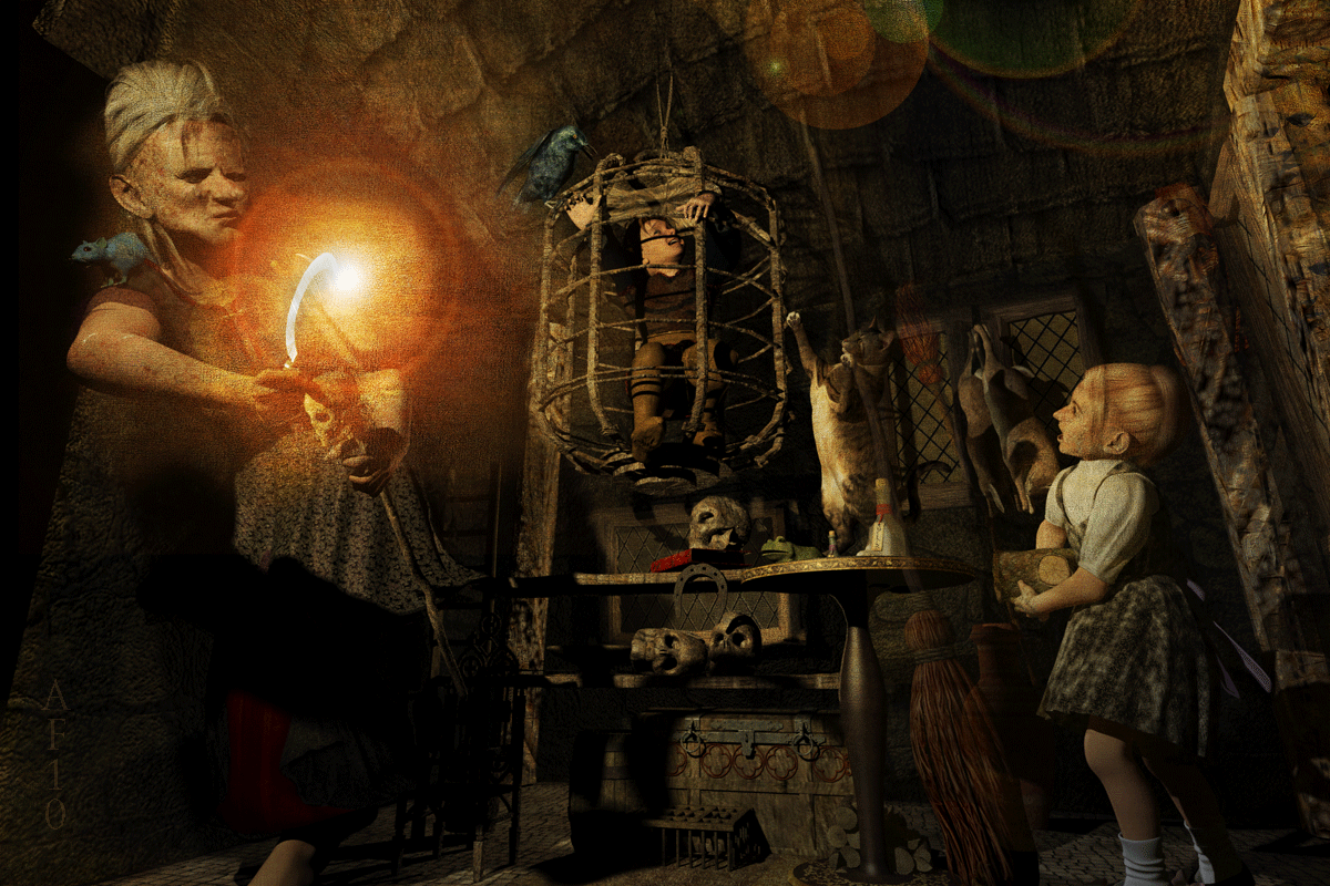
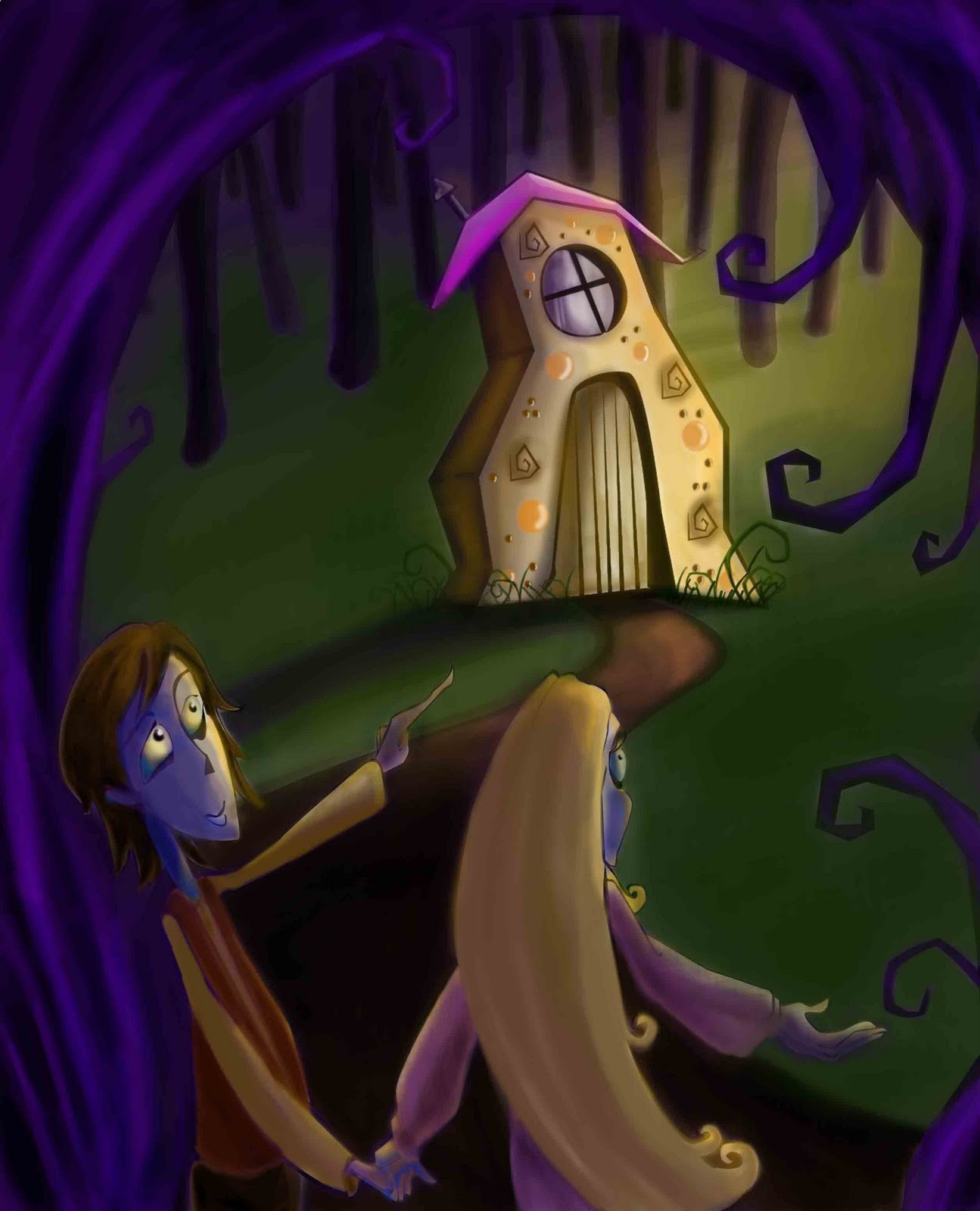
This piece has a really nice mood set with evening sun and contrasting shadows. We get the feel that even though this might get scary everything is going to be ok because big brother is watching out for little sister. Nice color harmony overall. I think you could give more of an indication of the distant house – perhaps centered in the symmetrical negative space you provided – or left out and give us more trees going back into the distance. A careful attention to anatomy and detail in the foreground would tighten up and bring focus and interest into your work. Nice.


This is a really cool style by Eric Arballo. The simplicity of form is charming and very readable. A good style for children’s books. Creamy pastel colors and texture give unity consistently throughout this piece. Right away I get what part of the story we are in. With more attention to anatomy on the figures, less demand would be placed on the viewer to decide if the figures are children or adult. Dropping the hill down would give more room to see some of the father’s legs. Love the simplicity of the crow – nice shape design.


This is a fun piece from Rani Bean. A fun overall composition – sweeping foreground tree leads the eye in a circular direction. A fun house shape and interesting characters make your piece very unique. The figures feel a bit low as their hands get close to the edge of the image. Dressing up the house with recognizable candy would help with the overall storytelling. Strong shadows on background trees would be consistent with shadow from house. Lightening values on the figure’s faces would make them seem more alive.


This one comes from Emily Decker. I think if I were walking through the forest and happened on a cottage like this I’d be in the old lady’s cage in no time. A strong foreground and misty middle ground gives drama as the forest fades away in the distance. Good storytelling with the figures – I get the sense that the older brother is trying to convince the sister to venture further. I like the moody mist but I wonder if it is carried too far? I didn’t think of this in class but without explaining where the mist is coming from I think it tends to be more than what is necessary to tell this story. Foreground trees should probably have the same focus as the children. While I know that the kids are going to be darker because they are in the foreground I think you pushed this a little too far. More light on the kids could bring more life into them. If you want to keep a strong silhouette you could bring the sky down behind them – a part in the woods.


We have a late comer! This beautiful piece is fromAngela Matteson – She’s a children’s book illustrator and package designer from Columbus Ohio. Using the story of the three little pigs is a fun way to spice up this vintage story. I love her quirky stylizations of these characters. The piglets are lured by cupcakes, cookies, and huge candy apple. I love the cookie shutters – I wish there were more hidden goodies like that – perhaps the roof line, edge of house could have decorative treats? Flower bed? I wonder if the lower left corner of the illustration could bring the eye back up with some sort of object – path, foliage, etc. Fun illustration!

Better late than never – here is an image from K.H. Whitaker – wife, mother, grandmother and aspiring children’s book writer/illustrator. I love the feel of this piece. The candy is so inviting I’m thinking about sneaking over there and taking some myself. I also really like the textures on the fabrics in the old lady’s clothing. This has a really nice traditional feeling for the original story except I feel that the witch isn’t witchy enough – she’s so sweet. I think the grandmother in you is too afraid to scare these young ones – the original story isn’t very friendly and actually isn’t compatible with children’s literature today. I feel that the background starts to get too dark…scary but perhaps would help the tree and house stand out more if lightened a bit. Thanks for letting me post this.

FIND TIME TO WORK ON HANSEL AND GRETEL

Monday, November 22, 2010

Find time to work on Hansel and Gretel


If you’ve already started working on a Hansel and Gretel piece congratulations! If you don’t know what I’m talking about check a few posts down – I’m going to post image creations from anyone who wants to take on this challenge. I’ve already received a really nice piece from Von Brimhall – Way to go man!

Here is a cute piece from Carl Offterdinger way back in the 1800’s.

To my class: In between turkey naps find time to work on your assignments – you’ll thank yourself later.

Project due date: Dec 8th when I’ll post all of the images I receive in jpeg form right here on my blog with a short critique.

MY FIRST ACRYLIC PAINTING IN 7 MONTHS

Sunday, November 14, 2010

My first acrylic painting in 7 months


This is a demo I did for my picturebook class at UVU. I was happy that I was still able to do it. I have to admit that I was a little nervous but I couldn’t let my students know it.

Also – we’re starting our Hansel and Gretel assignment tomorrow – Monday the 15th. Several people are going to do the project but do not want me to post the results online. That’s absolutlely fine – I’ll only post the images that you want me to post.
Good luck on it – My hope is that you can add another great image to your portfolio!

hansel and gretle? do this at home

Monday, November 8, 2010

Want to do this assignment?


This is an illustration from Hansel and Gretel by scott gustafson. (Scott I hope you don’t mind that I used your image.) We are going to be illustrating one scene from this story next week in my picturebook class at UVU. My students will begin this assignment on November 16 and their due date is Dec 8th. I’ve always wanted to try this so here goes:

I’m planning to post my students work right here on my blog and I’d like to post work from anyone out there who would like to participate along with us. The goal is to motivate my students as well as anyone who wants to roll up their sleeves and get busy with us. I’ll also give a short critique on these pieces and any of you can weigh in with your opinions as well. I think this will be a blast!

So here are the rules:
Original work only of course
size is 8.5″ x 11″ wide or horizontal (work larger if you like)
color or black and white
any medium
email me a jpeg of your finished piece – I’ll only post jpegs

Content:
You may choose any scene from the story. It can be dark and scary if you want – the original Brothers Grimm tale is quite ominous. You may also choose to lighten it up – fracture it if you want – this is your chance to do something really fun! The only content rule is that it must contain at least one character from the story. I often advise my students to pick a scene that is easily identifiable (as a Hansel and Gretel image) so they can get an editor or art director emotionally involved with their work.

So that’s it – you have an extra week to get going on it!

sample: penguin


Tuesday, November 2, 2010

A new book project


This is a sample image for a book I just finished writing and illustrating. I don’t have a publisher yet but will be sending it out soon. I was so happy with how this image turned out and I had to share it on my blog. The rest of the book is in full dummy mode (PDF) and hopefully I can get someone interested in putting some money behind it. I love telling stories through fun visuals and text – watching kids as they listen and look at my pictures is where it’s at. So far I’ve gotten a good response on this one….fingers crossed!
Oh, also this is the first image that I started and finished in photoshop – prior to this piece I had always scanned my pencil sketches and then finished in photoshop. It has taken about 7 – 8 months to become familiar enough with my wacom tablet to pull this off. It still feels a little foreign but it’s getting much easier.


Saturday, November 6, 2010

Re-Painting


I just wasn’t satisfied with the last finish on this piece – It felt over rendered in some ways and I think it lacked texture and the silhouette from the original sketch. I’m still finding myself in photoshop. I like the second version much better because you can still see some of the under-painting – a look I had in my traditional work.

HAPPY HOLIDAYS!

Happy Holidays!


I couldn’t wait to do a Seasonal piece this year. I finished this one (created in photoshop) last month but figured I’d wait till after Thanksgiving to post it. I’m sending this out as a post card so if you’re an art buyer and want to be on my list send me your contact info and I’ll shoot you one pronto!

sketch book don’t leave home without it

Sunday, October 17, 2010

Never Leave Home Without It!!!


About a year ago I committed myself to never leave home without my sketchbook. I’m happy to report that I’ve been successful in this quest however one time my pencil was out of lead and lost an hour of sketch time – a real bummer. One of my beliefs is that in order to become you need to live. In other words in order to become a ball player you need to eat sleep and drink ball. In order to become an illustrator you need to live the life of an illustrator – drawing constantly. Practice makes perfect and after living well into my mid forties I’ve come to realize how short life is – thus an hour wasted is practice I’ll never get back. Also, I’m a big believer in the 10,000 hour principle – you should google it if you don’t know it. The more hours of good practice = better performance later on.

I attended a Gregory Manchess lecture last week and he referred to the the finished painting as “the performance”. I’ve always believed this and have known that you won’t perform well if you don’t practice regularly. Manchess epitomizes the consummate professional in every way: well spoken, well mannered, art work that scores on every level of artistry. You could teach an entire illustration class using only one of his paintings.

I sketched this little village on Sunday afternoon and couldn’t resist spending 10 min tossing a little color around on it in photoshop. I love my sketchbook and it’s with me…where’s yours?