Well today is the day – I’ll be adding images as I receive them. If you haven’t been following over the past few weeks I decided to post images from anyone who wanted to participate in the assignment I gave my college class. To catch up – scroll down and find the first post on November 8th. It’s always very interesting to see the variation in style and concept that comes from different artists. I was going to try to finish an image for this assignment but ran out of time and got a nasty cold as well. That’s my excuse – good story huh?
I’m going to give a few observations for each piece but I won’t be able to give a comprehensive critique on all of these images. I think it would be great if you guys want to give your opinions as well – I only ask that you do it tastefully. Art is so subjective and I certainly don’t have all the answers. Stripped of innuendo a typed comment can easily come off the wrong way and we don’t want anyone to feel worse for having participated. Lets make it fun!
Really nice work Cameron – strong overall design and a fun twist on the story. The layout is easy to read and understand – I think the concept would work even better if the girl was eating closer to the boy. Hansel and Gretel are in some ways one character as far as the story goes and separating them begins to turn ambiguous. I also think it would be good to be able to tell that the house is made of ginger bread or graham cracker or something like that – perhaps icing could be seen in the seams.
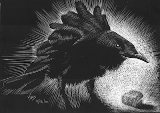
This piece comes from Von Brimhall and would make a nice vignette in the story. You have a nice feel for creating energy in the bird and great contrast between the bird and background. I think you could create a more subtle transition to black again or fade to white. The scratches above and behind the bird are really bold – they draw attention when they should help create relief. More detail on the feet would help to finish this into a really nice piece!

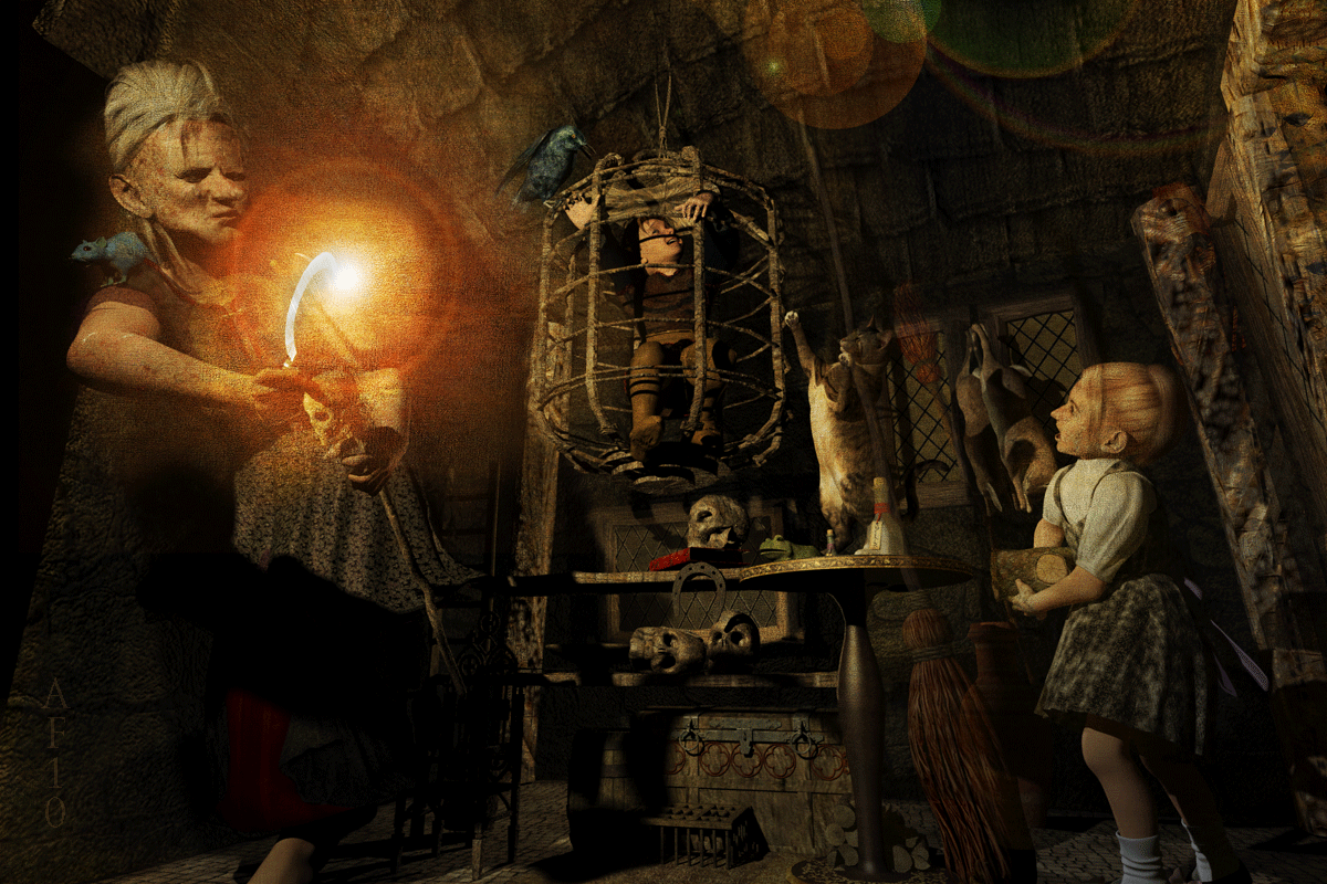
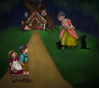
Andrew Finnie has a hauntingly beautiful style and his image for Hansel and Gretel brings us face to face with the reality of this grim tale. We are so insulated from the raw stories once told to children around the world. I really like all of the details found around the room – they add visual flavor to the concept – the cat in motion is wonderful. I’m having a hard time understanding what the old woman and girl are doing. We can clearly see the boy trapped in the cage and looking for a way out – great. I love the glowing light in front of the old woman – I just don’t know why it’s there.
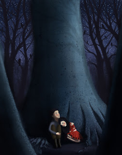
This is a great piece from Kari Larsen – I love the mood she has set with the color and dark values, dark birds, trees, contrasting with the light innocent skin tones of the children. The scale of the large tree also creates good contrast showing how vulnerable the kids are. The children really look lonely and scared with older brother doing his best to comfort little sister – great story telling! More delineation on the edges of the foreground tree would be consistent with background edges. More attention could be given to the construction anatomy of tree roots in the foreground tree – in keeping with your style. It would also be nice to see more light on ground below children helping to define dark side of children. Bringing children up or adding more image at the bottom would give you the space you need. Great Job!
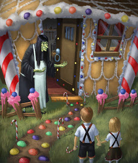
This art is from Aaron Anderson. This is a fun take on the story – inviting house, cute kids, enticing treats…I’m sold – I want a piece of this house! I think it would be more comfortable compositionally to have included the entire figures of the children…and I think this piece could have more impact if there was a more direct level of focus/movement controlled by value – I forgot to mention this in class today but if you preserve the brightest whites for the most important areas – or area. We also had a debate about whether the kids would venture into the house with a witch standing in front – conceptually I think it would be better to make her an old lady but make it clear that she has ulterior motives.
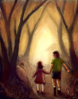
Nice work Michael Nikola! This guy usually paints in oil but can also get that really nice painterly look in photoshop.  This piece has a really nice mood set with evening sun and contrasting shadows. We get the feel that even though this might get scary everything is going to be ok because big brother is watching out for little sister. Nice color harmony overall. I think you could give more of an indication of the distant house – perhaps centered in the symmetrical negative space you provided – or left out and give us more trees going back into the distance. A careful attention to anatomy and detail in the foreground would tighten up and bring focus and interest into your work. Nice.
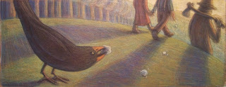
This is a really cool style by Eric Arballo. The simplicity of form is charming and very readable. A good style for children’s books. Creamy pastel colors and texture give unity consistently throughout this piece. Right away I get what part of the story we are in. With more attention to anatomy on the figures, less demand would be placed on the viewer to decide if the figures are children or adult. Dropping the hill down would give more room to see some of the father’s legs. Love the simplicity of the crow – nice shape design.
This is a fun piece from Rani Bean. A fun overall composition – sweeping foreground tree leads the eye in a circular direction. A fun house shape and interesting characters make your piece very unique. The figures feel a bit low as their hands get close to the edge of the image. Dressing up the house with recognizable candy would help with the overall storytelling. Strong shadows on background trees would be consistent with shadow from house. Lightening values on the figure’s faces would make them seem more alive.
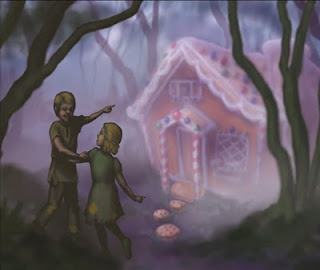
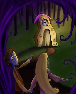
This one comes from Emily Decker. I think if I were walking through the forest and happened on a cottage like this I’d be in the old lady’s cage in no time. A strong foreground and misty middle ground gives drama as the forest fades away in the distance. Good storytelling with the figures – I get the sense that the older brother is trying to convince the sister to venture further. I like the moody mist but I wonder if it is carried too far? I didn’t think of this in class but without explaining where the mist is coming from I think it tends to be more than what is necessary to tell this story. Foreground trees should probably have the same focus as the children. While I know that the kids are going to be darker because they are in the foreground I think you pushed this a little too far. More light on the kids could bring more life into them. If you want to keep a strong silhouette you could bring the sky down behind them – a part in the woods.

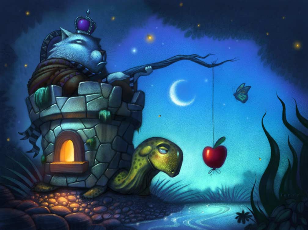
We have a late comer! This beautiful piece is fromAngela Matteson – She’s a children’s book illustrator and package designer from Columbus Ohio. Using the story of the three little pigs is a fun way to spice up this vintage story. I love her quirky stylizations of these characters. The piglets are lured by cupcakes, cookies, and huge candy apple. I love the cookie shutters – I wish there were more hidden goodies like that – perhaps the roof line, edge of house could have decorative treats? Flower bed? I wonder if the lower left corner of the illustration could bring the eye back up with some sort of object – path, foliage, etc. Fun illustration!
Better late than never – here is an image from K.H. Whitaker – wife, mother, grandmother and aspiring children’s book writer/illustrator. I love the feel of this piece. The candy is so inviting I’m thinking about sneaking over there and taking some myself. I also really like the textures on the fabrics in the old lady’s clothing. This has a really nice traditional feeling for the original story except I feel that the witch isn’t witchy enough – she’s so sweet. I think the grandmother in you is too afraid to scare these young ones – the original story isn’t very friendly and actually isn’t compatible with children’s literature today. I feel that the background starts to get too dark…scary but perhaps would help the tree and house stand out more if lightened a bit. Thanks for letting me post this.


 We were lucky enough to go hang out in LA and eat good food. An awesome road trip on the tax payers dime.
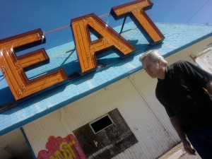
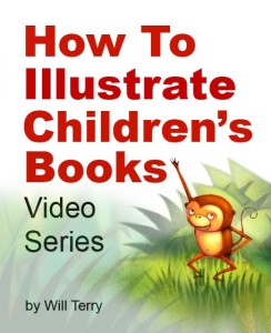
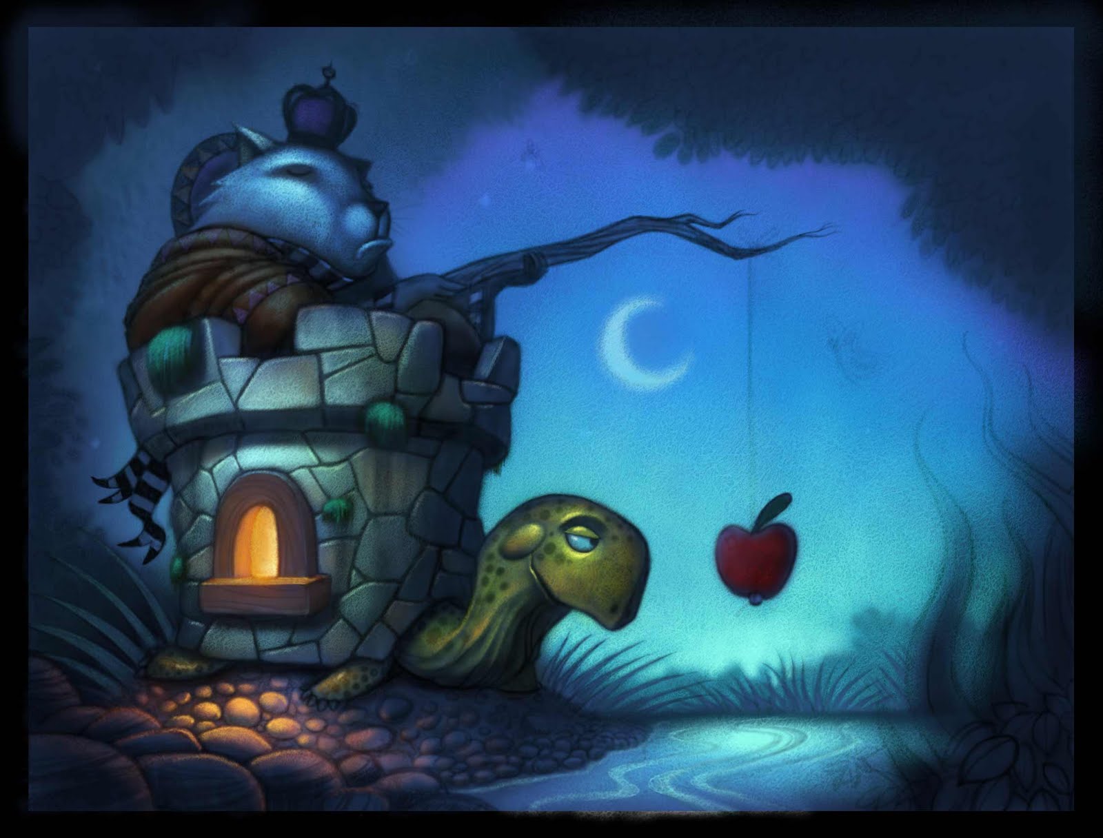
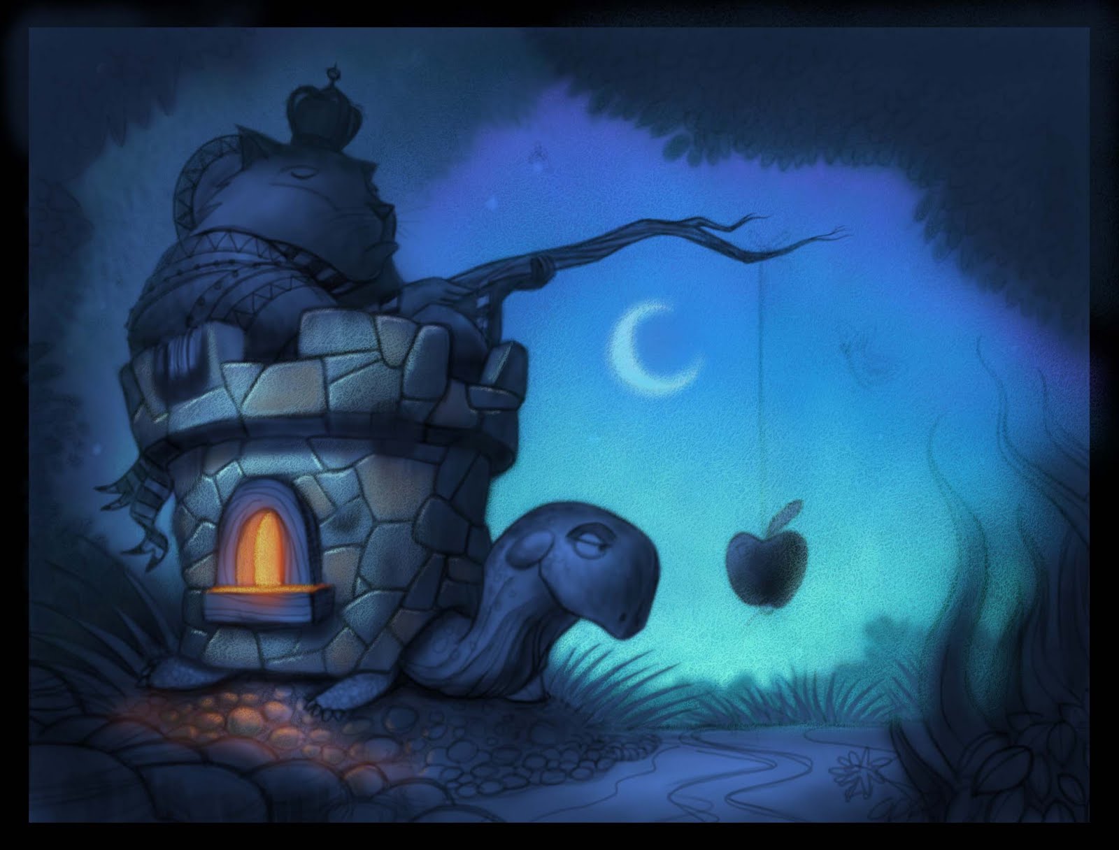
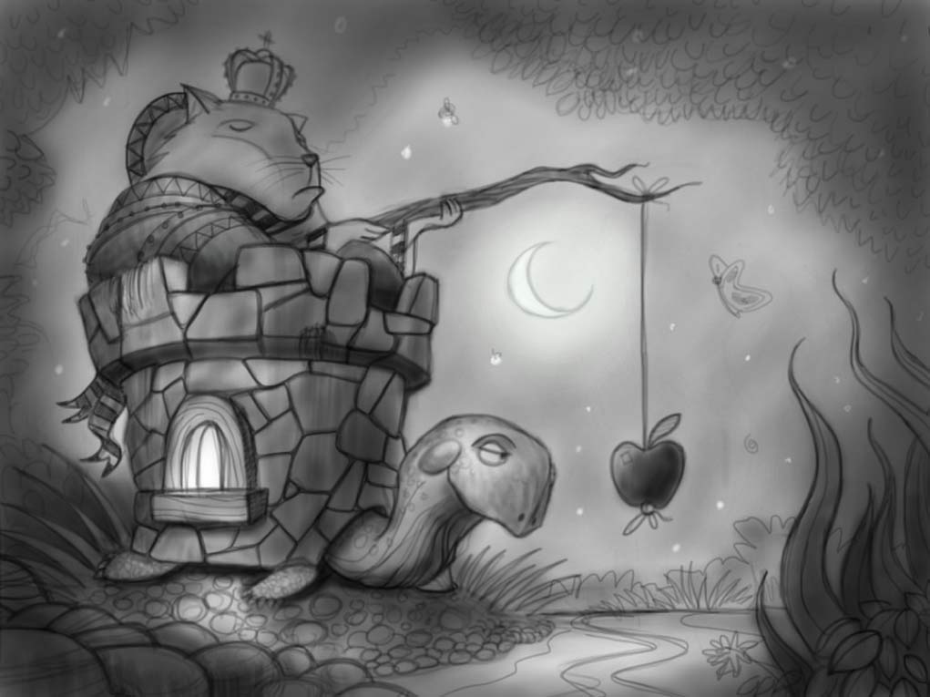
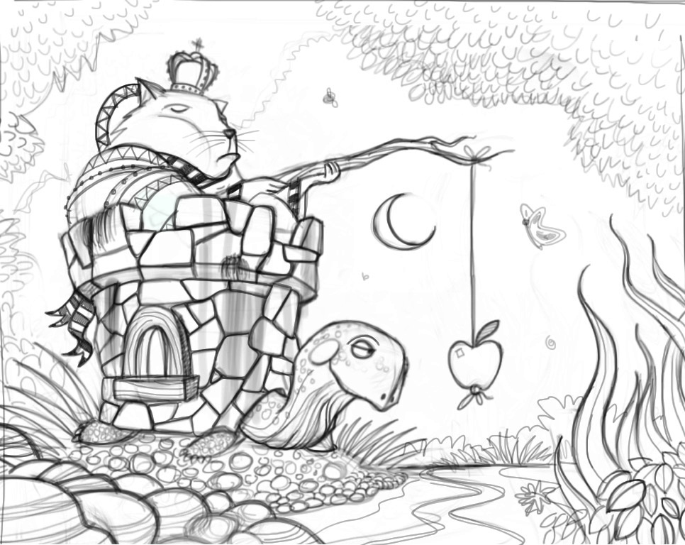
 It’s definitely not perfect but I’m proud of the work I put into it and hope that it brightens the lives of those who want to learn more about narrative illustration. Perhaps this isn’t your cup of tea but if you know anyone who might appreciate it send them a link.
 Thanks and have a beautiful day.