About Wayne

Wayne is one of the manager dudes at FolioAcademy.com, a site where anyone can learn to improve their artistic abilities with a growing compilation of video lessons from professional artists helping you with your craft by teaching you their secrets and techniques.

Scanning, Re-Sizing, Resolution, & Pixels in Photoshop

Getting the size and resolution right in Photoshop

This is mostly for beginners but a valid subject.

Scan your art or sketch and work in Photoshop to finish, paint or add color.

For those who sketch or start their artwork on paper but like to work in Photoshop

This is a question that we still get a LOT, so we want to address it.

Step by Step 

Scan your sketch or artwork into Photoshop at 150-300 pixels per inch.

Make sure Constrain Proportions is checked

Make sure Resample image is checked.

Set your pixels per inch to 300 pixels per inch.

Decide what size you want the printed piece to be and set your size. I.E. 8”x10”

There are a few things to be aware of when sizing a piece in Photoshop.

Get your Height, Width and Resolution right.

Get it into Photoshop and go to image then image size and just look at it.

Go down to Resolution in the Document Size area and see what you’ve got. If it says 150 pixels per inch, then that is how many pixels equals 1 inch in the resolution of your painting. Above the RESOLUTION there are the two Width and Height boxes, you want those in inches not pixels, so change that if you need.

Above that there are the Pixel Dimensions, this is the total number of pixels, not pixels per inch but per the entire piece. Set your width and Height to Pixels.

Make sure Scale to Style, Constrain Proportions and Re-sample Image are all checked. Like so.

Pixel Dimensions

Width      [big number]           Pixels

Height     [big number]           Pixels

Document Size

Width         [     8.5     ]            Inches

Height        [    11       ]            Inches

Resolution  [    300     ]          Pixels/Inch (Pixels per Inch)

[ x ] Scale Style

[ x ] Constrain Proportions

[ x ] Resample Image

Printers and publishers usually want everything to be at 300 pixels per inch.

They also want it to be so many inches, like 8×10″ for example.

You want your illustrations to look good. So…

Increasing the Resolution does not increase your resolution.


Set the parameters and get the scale right in Photoshop

Now that you are working on your sketch in Photoshop, you want to set the parameters and get the scale right.

Screen resolutions is about 72 dpi, (Dots Per Inch, or Pixels Per Inch)

There is nothing you can do to increase the actual information that you have. If you take a small picture scanned in at say 75 DPI and blow it up, it won’t give you ANY more detail. Like a projector, if you back it up and make the image on the wall bigger, the image will not be any more clear, just bigger. So Ideally, when you work, you want your finished piece to be big and clear, you can always make it smaller. Don’t go too big it takes longer for your computer to render.

If you have an 8×10 piece scanned in at 150 and you just change your Resolution to 300, it doesn’t actually change the resolution of your work and leave all the other parameters the same. It will decrease the size of your piece.

The reason I set my scanner at 150 instead of 300 is because I don’t need too much detail to go from a sketch to a finished piece, so I scan it in at 150 then change it to 300, then I work in 300 dpi so my finished piece will be acceptable for the printers, and it will have the detail and clarity that it needs for the size that it will be printed.

So you want your width to be the right size for the printer, say 8 by 10”.

You want your resolution to be 300.

Now you can zoom in on your work and zoom out without changing the end size or resolution.

Make sure Constrain Proportions is checked. 

[ x ] Constrain Proportions wants to be checked so that if you change the width, the height will change proportionally and vise versa. If you want the width wider but want the height to stay the same, if you just change the width, it will skew your art, so it would be better to keep your proportions, so you should just size it bigger and cut some off.


MAKE SURE resample image IS CHECKED.

[ x ] Resample Image is important so that if you change your work from 150 pixels per inch to 300, it will boost your actual pixels per inch as well. Otherwise, with Resample image unchecked, you could change your work from 150 to 300 Pixels per inch and  size of your work will drop to compensate for the change. Now when you go to ship that finished work to the printer, your 8 by 10” piece will be more like 4 by 5”, and that is not good. You Cannot just make it bigger with out making it all pixilated and blurry and crappy.

What a publisher wants

Most publishers want your work to be at least 100% of what they want to printed piece to be. 8-9” by 10-11” and at 300 pixels per inch.

 Have fun with it, explore. 

Fool around with some of these and see what happens to your image and the other perameters when you make changes with Constrain Proportions and Resample image checked and unchecked.

The danger is that you can be working along and not realize that your pixels per inch or your resolution or your document size is way too small until you are finished. And that is a painful lesson. Ouch!


for more info on this same thing, watch this video by Will Terry.

an Artist’s 6 Steps to Illustrate a Concept

How would you Illustrate, Early?

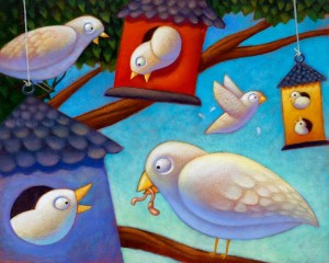
If you were given a “carte blanche” assignment to illustrate the word, EARLY, what would you come up with. They say that if you give a thousand people the same task, they would come up with a thousand different ways to do that task. I would say that the same thing goes for ARTISTS. If you give a thousand artists the same assignment, (i.e. word or phrase to illustrate) you would get a thousand different ideas and portrayals.

Most illustrators use a step by step process

early birds Now that I have posted this pic of bi

Painting a Hobbit Home or Gnome Home in a Tree

Pencil Sketch & Digital Painting of a Hobbit Home

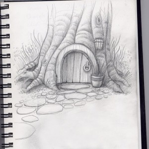
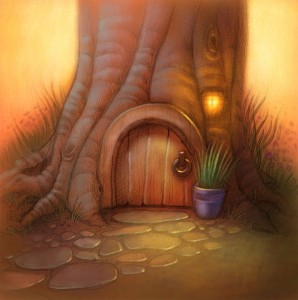
Before and After pictures of a hobbit home, sketched then painted in Photoshop

Gnome home, a door in a tree

Before

Here is a Before and after set of pictures of a basic drawing or sketch and what it looks like once it’s been scanned in and painted over via photo shop with the digital painting techniques taught in our beginning PS course, Painting in Photoshop and our Advanced Digi Painting in Photoshop art courses at FolioAcademy.com.


soft back light and the soft edges of the tree and background flowers

digital artwork of a Hobbit home or gnome home

After

I love the soft back light and the soft edges of the tree and background flowers. I like the porch light being on too, In real life I hate any of my lights left on when it’s not necessary, but it works well in paintings and photography. I also like the arbitrary almost, cool, light on the door and the stepping stones. They didn’t over due it with color either so the little violet pot and green plant just kind of pop. Note how the artist crisped up the lines and edges on the door and plant, to direct and focus our attention on the door knocker and the potted plant. The sketch above also has some of that soft line quality that was later used in the final piece.

You may also want to notice the cool colors in the very warm painting. Especially on the left side of the tree trunk. Warm light, cool shadows.  Nice huh?

Have a blessed day :)

I Can’t Write, BUT You Get to Illustrate my Book

Hey I just met you this is crazy here’s my manuscript, illustrate it for me. 

Have you ever been in this situation as an Artist?

How often do people offer you the opportunity to do the artwork for their children’s book? It seems that as soon as people know you’re an artist, they want you to illustrate their book. They haven’t got a clue how it works in the real world of illustration, or that maybe you don’t want to spend a few hundred hours designing, drawing, and illustrating a story that it took them 2 hours to write. And it’s their first book, and probably not finished and will need you to fix the story.

It’s always awkward. It would be flattering if these people knew your work, but most don’t. They usually just know your an artist and they they know, (or think) that they are a children’s book writer.

Any way, we put this together awhile back using Xtranormal.com. I would recommend it for you to go have some fun with it but I can’t find it out there any more. I wonder if xtranormal is gone. Oh well, you can waste a LOT of time on there.


The Day of the Teacher: Poster by Will Terry

Speed Painting of the CTA Poster 

Will Terry was commissioned to design, and illustrate the poster.

Will was asked to design a drawing and render some art to celebrate California’s “Day of the Teacher” celebration. He decided to incorporate multiple career choices into the poster and to a city-scape type setting. He also uses color in his beautiful style so it is fun to look at and fun and entertaining to watch.

Here is the speed painting by the semi famous, Will Terry.  Give it a look, it’s only 3 minutes long and set to good music. He says he could play with these shapes all day. But lucky for us, he time-lapsed it so we can watch him in 3 minutes.

Thanks Will for recording this so we can all enjoy your work.


Line Quality: Artists Use this Simple Tip for a Better Drawing

 Line Quality, the Thick and the Thin: Get in Line for better design

Through Thick and Thin, Let the Quality Begin

line quality

Before and After

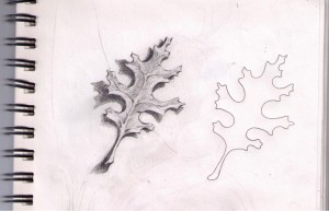
To illustrate how Thick, and Thin Lines make a more Interesting Drawing, I just took a little plastic template with a few shapes to choose from and quickly traced out these little leaflets to the left here. The first one, on the left, I just drew with a consistent, uniform line and it reads as a leaf. But is a very basic drawing. The one on the right, I traced lightly with the same template and pencil. When I was done, I decided that the light source would be in the top right or up above and to the right. So I lightly erased a lot of the lines that would be bathed in light if the light were coming from the top right. Then I took a real pencil, a 6-B I think, and I darkened and thickened the lines in the areas that would be less likely to have direct light shining on them. The bottoms of the leaflets and to the left. This is a good little exercise especially for beginners.

Thick and Thin Lines Make a More Interesting Drawing

A sketch of two leaves, one with good lines and the other, plain.

After and Before

Here I took the same plastic template but traced a different pattern. The oak leaf. The one on the right, as you can guess, I just traced with a uniform line. Equal pressure, no thick no thin, just plain old line. Yes you can tell it is a leaf, you can tell it’s an oak leaf. That is, if your a boy scout or someone that knows what an oak leaf looks like. BUT… The one on the left, has a little more depth to it. A little, a lot more interesting to look at. It is more likely to make it to my moms refrigerator. Once again, I chose top right for my light direction, I softened the lines that would be lit, and then I darkened and thickened the bottom left-ish lines.
And as you can see, I shaded the leaf in and put a cast shadow under it to help lift it off the paper and give it some life.

I don’t always draw dinosaurs, but when I do, they’re happy. ~Bob Ross lol

I don’t think Bob ever said that, but it’s something he should have said. 

Line Quality Dino Skull

This little sketch has been in my sketch book for a long time and one of my children helped me a little bit while we were in Church. Well, to stay awake in church, I often get my sketch book out and doodle or sketch. I hope the congregation folk just think I’m taking copious notes.

“That Wayne Andreason brother sure gets into these sermons!”

Some times to keep my kids still-ish, they sketch too, but when they get board of that, I let them look through my sketch book. And sometimes they “help” by adding to my sketches. As you can see that the top of this skull has got some thick lines where they should be thins. Well, my excuse is that my daughter or son, started drawing over some of my lines. Especially on the brow and over the nose, otherwise the line quality still works with this drawing or sketch.

“That brother Wayne is long winded!”

Folio Boys go to So Cal

I am lucky to be Will’s best friend

This video isn’t that great but it is cool to see Will Speaking to Millions of peeps.
Since the California Teachers Association (CTA) loves Will’s artwork for children so much, he has been able to represent the CTA two times so far. So they paid for him and his wife, or if she was too busy or not feeling well or what ever, He was able to take some significant brother. That’s me, Will’s best friend, Wayne. So we loaded up the truck and we went to Beverly, LA that is, swimming pools, movie stars.
Well the next thing you know, Old Will‘s on stage up there, over the weekend he was a celebrity, he got to represent the California Teachers Association again with his Armadilly Chili Book. He had a blast and he even got to say a few words in front of the group. That’s him up there.
I couldn’t believe how they crammed more than a million people in the ballroom.

We SOLD OUT on Saturday afternoon – We couldn’t believe it! Over 500 books! They even made a plush out of Tex the tarantula, – you may still be able to buy it here. Author’s note, Not Terry the tarantula who was slow roasted to death in a jar, but Tex, a character in Armadilly Chili. 

They took very good care of us – too good!

On Sunday we drove down to visit illustrator Steve Gray in Hermosa Beach. He’s a great guy and a decorated illustrator – he won the Grand Canyon Reader award last year for his Coyote book.

Steve uses one of those nifty Cintiq Tablets to render his illustrations. He used to do quite a bit of advertising illustration back in the day and his studio walls are decorated with many impressive and recognizable work.

Pick up a copy and enjoy his wacky drawing and wonderful color and Jennifer Ward’s great story.

You can’t go all the way to the beach without actually getting your feet wet right? I’m the short one on the right.


I guess we weren’t the only ones having a good weekend.

No this is not how we found Will’s wife’s car upon our return, they are still happily married. We saw this car outside of “The Mad Greek” Near Vegas, where we stopped for one last overdose of gluttony on our way home.


How Should I Protect My Artwork From Online Theft?

Can I Protect My Artwork, Illustrations and Ideas From Theft? Should I?

I am often asked about this BUT I don’t really worry about it.

Amanda asked, how to protect her artwork online since she would soon be publishing her portfolio. My answers may or may not surprise you but I’ve compiled my thoughts based on the examples of my illustration and animation friends and other artists that I know. There seems to be a shift from the way things used to be done.

Continue reading

Painting Color and Light for illustrators and artists: contest part 2

Start with a good drawing.

There’s still time, to do the Coloring contest, see post

It seldom works to start with a bad design and then just fix it with color. Good light and color will look better with a well designed drawing.

It would be nice to give you all the answers but I think I’ll give you all the questions, that way you can come up with the answers.

Things to consider for your artwork

Light and Shadow What is value and how is it used?

What are gradients and how do they work in a drawing?

Can drawings work in mostly light values, dark values, both?

Lighting shapes, What direction should my light be coming from?

How does light fall on a sphere, cube, cylinder, & human form?

What is the relationship between the darkest dark and lightest light?

Why is reflected light important to show form?

What are cast shadows and what happens to their edges?

What direction do shadows go?

What are occlusion shadows?

Painting Color, What colors should I buy or use?

Are white and black colors?

Should you ever use black?

What happens when you mix various colors?

What are cold & warm colors?

What is a vibrating color?

What are color opposites?

What’s the difference between primary, secondary, and tertiary colors?

What are tints, shades, and gradients?

What is a triad?

How can you neutralize two colors?

What’s is a complimentary color scheme and an analogous color scheme?

How can I get rich color in my painting?

Where can I learn to draw and paint better?

How can I enter the little coloring art contest for artists and illustrators everywhere?

PRACTICE for PAINTING COLOR & LIGHT; ART CONTEST

Homework for Painting Color & Light

Here is a little assignment you can do, or not, but if you would like to, take the challenge and see what you come up with.
I would love to see what you come up with and maybe blog some of it. If you do something pretty cool, attach it to me in and email. Well, don’t attach it to me, attach it to an email and email it to me to my personal email.
WayneAndreason@Gmail dot com

Art Contest 

(I just got an idea forming in my brain, this is now an art contest or a painting contest, or maybe a coloring contest, either way, see below, or the bottom, or the end of this blog for details.)

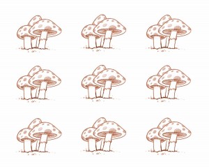
Just Color These

If you can figure out how to download these drawings, or save them to your computer or device, print if you wish to paint traditionally, or work digitally if you’d rather. Or do your best to draw them.
Then color them.

Variations of a theme. 

Colored-Mushrooms-lineSM

Take these mushrooms and make set different. That is, color them different colors, explore different light, colors and what ever. We have an example at the end of this blog if you want to see some possibilities.

Complex things are made of basic shapes

practiceDrawing

Bare in mind, that most things are built with basic shapes, so this is simplified. Take it and decide what you will do with it. Light source and direction. Warm light, or cold, dark and dingy or light and cheery, you decide, add detail if you like.
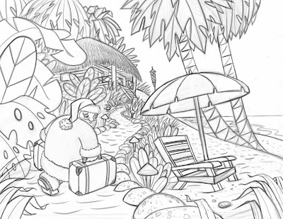
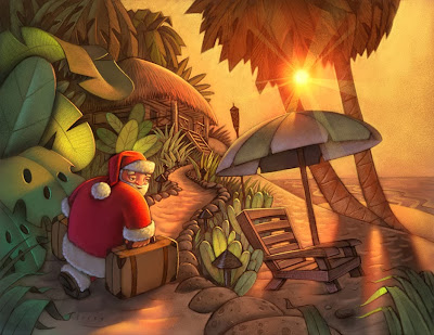
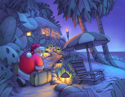
Santa Claus (AKA Father x-mas) on a Tropical Island

SantaBeachValue

So Santa is on the beach. See what you can do with color on this one. Is it morning, is it noon day, is it evening, morning, or night? You decide. Do one in the day and one in the night if you dare. Same scene but Night vs Day.
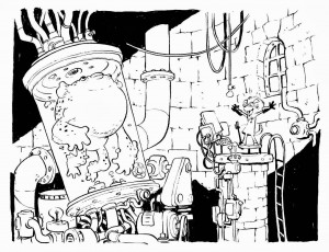
Mad Scientist in his Laboratory

jakes

This is an awesome black and white that Jake Parker drew during his Inktober phase last year. This could be realy fun to color, heck it’s fun just the way it is. Think of what you could do with color. You could use harsh light, contrasted by soft light, maybe some creepy fog. Have fun with it. This should be fun for comic book and graphic novel lovers.
and this is “below, the bottom, and the end of this blog”

contest details: 

Entries must be emailed to me WayneAndreason@gmail dot com (that’s code, figure it out, the dot means period and there are no spaces) as an attachment in the form of JPEG, no later than one week from today, Okay, 8 days, take Sunday off and go to church for a change. (this was an attempt at humor, please don’t take offence, I can only be so PC)

We will find some artists in the community to judge the artwork who will choose 1 to 4 winners, depending on how many entries we get. Or maybe I should say 0 to 4 winners as we may not get any entries.

By entering a piece or more, you are giving permission for that piece to be displayed on the internet etc. Just in case.

The winner/winners will get a FREE Folio Academy art lesson course of their choice.

Contestants are not allowed to EVER be offended by Will’s or my attempt at humor. We mean no harm, except to that girl named Tammy who tore up a picture I drew of a dinosaur back in second grade. I do mean to offend her but she can still enter. I promise I won’t tear it up. I think her last name was Roundy.

and oh yeah, you can’t go around selling it as your own work as the drawings are drawn by Will Terry

and Jake Parker who are famous artists and hold copyrights.

have fun.

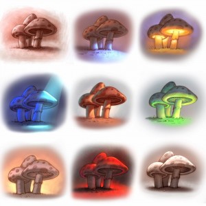
EXAMPLE: COLORED MUSHROOMS

So we took the mushroom theme and ran with it to give you and example of what you could do.

Colored-Mushrooms


PS if you know Tammy Roundy that went to Lincoln Elementary school in Salt Lake City about 45 years ago, tell her to friend me on FB. Any of you may friend me too. thanks. Your best friend, Wayne  https://www.facebook.com/wayne.andreason