A QUICK LITTLE DIGITAL PAINTING OVER A QUICK LITTLE PENCIL SKETCH

Two Hour Pencil Sketch, Painted in Photoshop

Folio boy will Terry draws in pencil & Paints in Photoshop.

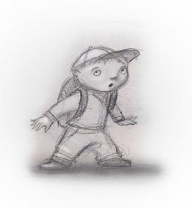
little Boy painted in Photoshop little Boy sketchSince I have been telling lately about my transition from acrylic to digital illustration, I thought I would post these little After and Before pictures ot a sketch I drew then painted in Photoshop. In the beginning I was able to get a handle on the digital painting a lot faster than digital sketching and designing the drawing. So I would do a basic drawing and then finish it in Photoshop. I also enjoy a lot of the play between the pencil drawing and the painting. I left a lot of the hatchy, sketchy, pencilly, lines shining through the paint, on purpose.

This little study took me just two hours to complete and was a lot of fun.


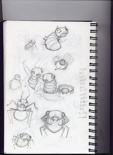
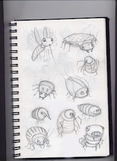
Just Thumbing through my sketch book.

Back when I was designing characters for Nasty Bugs. 

A page or two from my sketch book 

Here is a little image of a page or two from my sketch book.
Takes me back, I had just finished an e-book, (self published) called Tickle Bugs. Back off, it was for kids. Any way, when I got this buggy job from Dutton. I just had to design and draw a bunch of cute little bugs again. Fun huh.

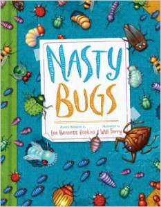
Nasty Bugs, by Lee Bennett Hopkins (Author) , Will Terry (Illustrator)

nasty-bugs a children's book
These sketches are characters that made their debut in a book called Nasty Bugs. It’s a really fun book and I couldn’t wait to start painting it as soon as all my sketches were finally approved.
I remember I was still trying to figure out how to draw with my Wacom tablet at the time, I could paint with it but I still wasn’t able to get the sensitivity I get with pencil and paper. Perhaps it was the lack of texture provided by the tablet – or the disconnect between my hand, eye, and computer monitor, maybe I’m just stupe. Anyway, I would continue to force myself to practice it until frustration would eventually win and I would hit print and finish it on paper. That practice has paid off by the way.
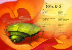
A page from Nasty Bugs
nasty-bugs2
Love how this one project turned out. Painting in Photoshop makes it so much more do-able to paint in the stink, undo it if it isn’t just right, do it over and adjust the transparency and color til it looks like stink. Or smoke or steam. (there is now steam tool in a Photoshop plug in by the way. That was an April fool’s prank. Sorry.  :(
if you missed that one you really need to check out our April 1, 2014 blog post. It is still fun to share to unsuspecting artists and artist wannabes for a good prank.

Drawing & Painting on iPad Demo using Procreate & Speed Painting

Artist Demo on iPad using Procreate and a Cheap Stylus

Working From General to Specific I start by Roughing it in
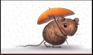
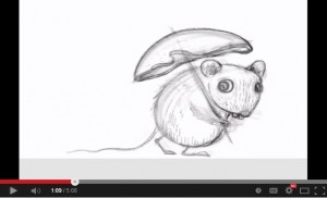
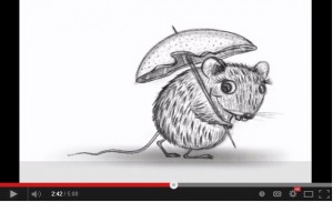
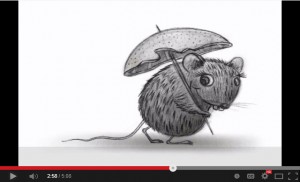
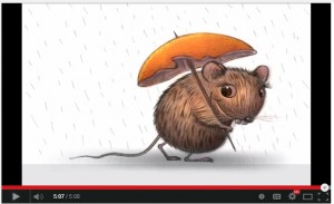
Rat with an Orange Peal Umbrella

Last week I mentioned that I “found the perfect Stylus” and I showed you a few steps and told you to work from general to specific, as I was taught by my friend and mentor, Robert Barrett. AKA Bob Barrett.

This was a little 2 hr drawing, of a Rat character that I did in Procreate. I had this Idea to draw a little rat that made made an umbrella out of an orange peal and a tooth pick.

Video below for Artists who hate to read

If you are like me and you don’t like to read. I get a lot of questions about my process so I thought I’d do a little demo, in fact if you scroll to the bottom you can just watch the video. It’s a speed painting but I talk it through.

Start your drawing by blocking in your sketch
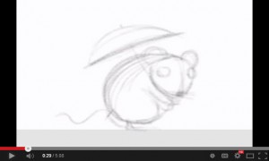
000 Wet Rat 02 000 Wet Rat 03

I always start by blocking in the basic shapes. I’m on my iPad right here, if you saw last weeks post, you may remember that I use a real cheap Targus stylus pen, stylus that you can get for about $12.00 at Target or Walmart. I like the blunt tip, as I like to block in the basics to start.

But what about detail? Keep reading.

Add Detail with a blunt tip by Zooming In

000 Wet Rat 05 000 Wet Rat 06

What you won’t see in these pics or the video below, is that I am zooming in to add detail. If you get the basic shapes in first, you don’t need to worry about ruining it by adding detail too soon. Plus, zooming in to add eyelashes and fur and stuff and I am putting it in the right places as the basic shapes are there. So when I zoom in, I still know where I am.

Work the entire picture as you go for a constant look.
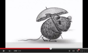
000 Wet Rat 07 000 Wet Rat 08I don’t work one spot to completion but rather, I go over the entire picture over and over again. As I add fur, I do it all over then add a little more, then work something else, like more fur, shade etc. Bringing the entire sketch, slowly to a more finished look. Not staying in one place too long. This also helps you get a consistent feel throughout the entire painting. This way I am happy with it before I dive into the detail. General to specific I tell you. Bob knows his stuff.

I use a few layers but not a lot.
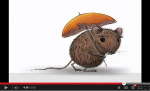
000 Wet Rat 09I used three or four layers on this drawing. Then I flatten them down. And maybe add another layer, so I can edit new stuff before I flatten it down again. I like to use a new layer when I start on another area. That way you can edit as you go. After I get the drawing complete, more or less, I can add color. Note how I add color to the whole piece 000 Wet Rat 01then move to some more color. Once the value and basic color is in place, I work some more color. Shadows and highlights.
This is not how I usually Paint, but… 

Warning! there will be a few adds here and links our website store. 

On my children’s books and bigger illustrations, I work differently. I might get started on my iPad then move it to my desk top and use my Cintiq monitor or Wacom tablet and Photoshop. I would add the color there and add the detail later. Probably because of the size of the full spread files and what not. I am finishing this one in Procreate for demo purposes. One of the cool things with Procreate is that you can export your video, going into tools while in your drawing, export it, like to Drop Box and it sends out a little MP4 file. There I can work faster, esp with the Cintiq monitor. Plus I can get the texture that I really want. I like the Progreate tools but I prefer the Cintiq monitor or Wacom tablet for adding the detail and color.

When I Illustrate Children’s Books, I Use my Cingiq Monitor.

If you want to see more on that, you can find tutorials on FolioAcademy. There are a lot of digital video courses, like for Photoshop, How to illustrate children’s books, how to design a drawing and a lot more. Here is where you can find my courses and you can also choose from a lot of other artist instructors.

iPad Speed painting Demo Video using Procreate & a cheap stylus



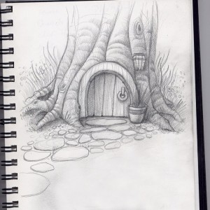
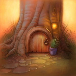
Painting a Hobbit Home or Gnome Home in a Tree

Pencil Sketch & Digital Painting of a Hobbit Home

Before and After pictures of a hobbit home, sketched then painted in Photoshop

Gnome home, a door in a tree

Before

Here is a Before and after set of pictures of a basic drawing or sketch and what it looks like once it’s been scanned in and painted over via photo shop with the digital painting techniques taught in our beginning PS course, Painting in Photoshop and our Advanced Digi Painting in Photoshop art courses at FolioAcademy.com.


soft back light and the soft edges of the tree and background flowers

digital artwork of a Hobbit home or gnome home

After

I love the soft back light and the soft edges of the tree and background flowers. I like the porch light being on too, In real life I hate any of my lights left on when it’s not necessary, but it works well in paintings and photography. I also like the arbitrary almost, cool, light on the door and the stepping stones. They didn’t over due it with color either so the little violet pot and green plant just kind of pop. Note how the artist crisped up the lines and edges on the door and plant, to direct and focus our attention on the door knocker and the potted plant. The sketch above also has some of that soft line quality that was later used in the final piece.

You may also want to notice the cool colors in the very warm painting. Especially on the left side of the tree trunk. Warm light, cool shadows.  Nice huh?

Have a blessed day :)

Line Quality: Artists Use this Simple Tip for a Better Drawing

 Line Quality, the Thick and the Thin: Get in Line for better design

Through Thick and Thin, Let the Quality Begin

line quality

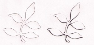
Before and After

To illustrate how Thick, and Thin Lines make a more Interesting Drawing, I just took a little plastic template with a few shapes to choose from and quickly traced out these little leaflets to the left here. The first one, on the left, I just drew with a consistent, uniform line and it reads as a leaf. But is a very basic drawing. The one on the right, I traced lightly with the same template and pencil. When I was done, I decided that the light source would be in the top right or up above and to the right. So I lightly erased a lot of the lines that would be bathed in light if the light were coming from the top right. Then I took a real pencil, a 6-B I think, and I darkened and thickened the lines in the areas that would be less likely to have direct light shining on them. The bottoms of the leaflets and to the left. This is a good little exercise especially for beginners.

Thick and Thin Lines Make a More Interesting Drawing

A sketch of two leaves, one with good lines and the other, plain.

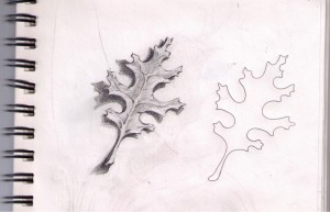
After and Before

Here I took the same plastic template but traced a different pattern. The oak leaf. The one on the right, as you can guess, I just traced with a uniform line. Equal pressure, no thick no thin, just plain old line. Yes you can tell it is a leaf, you can tell it’s an oak leaf. That is, if your a boy scout or someone that knows what an oak leaf looks like. BUT… The one on the left, has a little more depth to it. A little, a lot more interesting to look at. It is more likely to make it to my moms refrigerator. Once again, I chose top right for my light direction, I softened the lines that would be lit, and then I darkened and thickened the bottom left-ish lines.
And as you can see, I shaded the leaf in and put a cast shadow under it to help lift it off the paper and give it some life.

I don’t always draw dinosaurs, but when I do, they’re happy. ~Bob Ross lol

I don’t think Bob ever said that, but it’s something he should have said. 

Line Quality Dino Skull

This little sketch has been in my sketch book for a long time and one of my children helped me a little bit while we were in Church. Well, to stay awake in church, I often get my sketch book out and doodle or sketch. I hope the congregation folk just think I’m taking copious notes.

“That Wayne Andreason brother sure gets into these sermons!”

Some times to keep my kids still-ish, they sketch too, but when they get board of that, I let them look through my sketch book. And sometimes they “help” by adding to my sketches. As you can see that the top of this skull has got some thick lines where they should be thins. Well, my excuse is that my daughter or son, started drawing over some of my lines. Especially on the brow and over the nose, otherwise the line quality still works with this drawing or sketch.

“That brother Wayne is long winded!”

You can’t just fix a bad design with good color

If it don’t work in Black and White, it ain’t gonna work in color. 

A good painting will also look good in Black and White. That is to say, if you can’t work out your value patterns in black and white, you won’t be able to just fix it with color. Have you ever heard of a grisaille, (that was a tough one to sound out, let alone spell) It’s a black and white under painting. I think the word gray, or grey, as I like to spell it, comes from the same root.

What is a Grisaille and how do you pronounce that?

Grisaille (/ɡrɨˈz/ or /ɡrɨˈzl/French: gris [ɡʁizaj] ‘grey’) (Giz-eye is how I pronounce it) is a term for painting executed entirely in monochrome or near-monochrome, usually in shades of grey. ~Wikipedia 

Work out your lights and darks before you add color

So, where was I? Ho yeah, it is often wise, especially for beginners, to work out you lights and darks before you move to color. I like to give it the squint test. Squint at your work and see if it reads well. Do the wrong things disappear? Do the right things stand out?
The under painting can be in a sepia or other tone too, for a nice effect, it doesn’t have to be BLACK and White.

Light and Shadow

Where is your light source? Is it in the picture? If so, you shouldn’t have anything in the painting that is brighter than the light source.

Are the shadows, cast, core etc, in the right places? I am thinking that the cast shadow in this piece is not dark enough.

Do you have reflected light in the right places?

Just add Color, or Colour as my UK friends like to spell it.

If you are painting digitally, like in Photoshop or on the iPad, you will enjoy the ability to undo. If you are using water colors then you can just glaze transperant colors over you black and white under-painting. AKA Grisaille.

If you are using oil paints, you may want to try a water color, acrylic, or gwash, (i better look that up) Gouache. The oil paint goes right over the aqueous paints without disturbing them and it works really well. You should see how Robert Barrett uses gouache, for under-paintings to create a beautiful effect. He calls it a “Rub-out” technique.


Working with Color

I Used to Struggle as an Illustrator & I Still STRUGGLE with My Art

If You only knew How Much I Used To Struggle!

 In fact, I still STRUGGLE with my art.

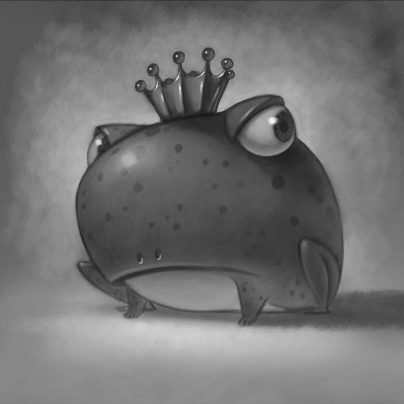
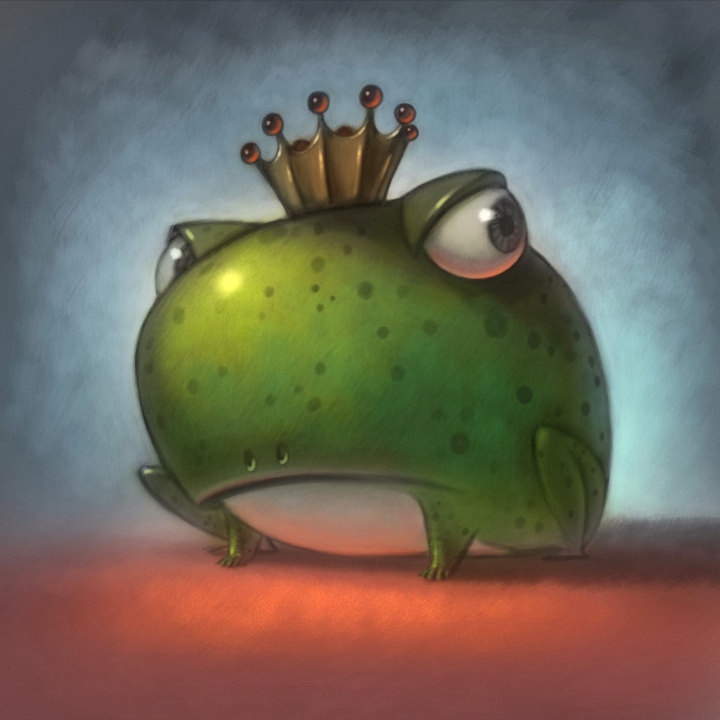
Fish King

To this day I still have a problem drawing in front of people. I have no problem painting in front of a group but I’m so unsure about my drawings I get really self conscious.
This fish for instance goes through a really rough loose stage that changes form many times before I start to see things I like. Often I don’t like where it’s going and have to start over from scratch – that would make a really fun demo wouldn’t it? (sarcasm intended)… and the fear of that happening is paralyzing – so I don’t often draw in front of my classes.
A lot of our artist friends that are realy good at what they do, don’t want to do a course for folioacademy because they are afraid of the camera, they don’t want the world to see them struggle.

Developing Your Art Skill Takes Time

I know I’ve talked about this before but I really want you to know two things:

1. This art thing that you want to get good at takes a long time – a lifetime really.

2. It’s really fun when you start to put all the pieces together and start creating images that gather an audience!

Assignment: Create a “Fish King Character”

King Fish line artI gave an assignment to create a “Fish King” character in my Imagination and Visual Literacy class at UVU and invited my students to send me images to post – some of them took me up on this invitation. I hope they realize that they draw better than I did when I was going to college. In fact, I was put on “probation” as a provisional student for being such a horrible artist. I was one of the few that didn’t get a studio space my junior year and I was on probation, I had to improve or I wouldn’t be in “the Program” my senior year. So I spent my Junior year being a lesser student. Yes that was stressful and depressing. And scary, to spend three years in University just to be told that “I can’t be an artist”.
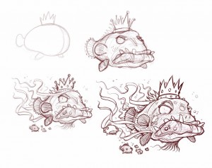
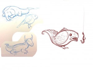
Here are some preliminary sketches.

Oh yeah – it was my son Aaron’s idea to put fish hooks in his lips – credit where credit’s due!

Evolution of a Fish King.

King Fish line art c


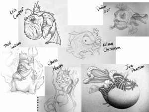
Here’s What My Students are Drawing

King Fish line art d

I love the diversity you can see in their work. By nature artists want to be different. Artists want to show the world something they’ve never seen. Check out Dallin Orr’s and Todd wilson’s work.

I don’t mind admitting it, some of my students are a lot better artists than I was at their stage in the game.

 Here are a few warm up sketches I did.

King Fish line art b

The Pose-able Wooden Artist Doll Has Come a Long Way, Baby.

The Pose-able Wooden Artist Doll Has Come a Long Way, Baby.

Meet the new!

poseable 2

Meet the old. 

Every artist has contorted their hand and looked in the mirror trying to figure out how to draw different poses. The wooden doll was a great invention for capturing gestures of the basic human figure.

Now for around $300 plus shipping you can get the S.F.B.T-3. WOW! This doll has few limitations.

Manufactured in Japan by Dolk Station, the S.F.B.T-3 is made from ABS resin, which is stronger than the colour range used in the first version. Priced at US$300, orders can be shipped internationally.

Ten years in the making, this girl has 80 moveable parts in her body, allowing for an unprecedented number of poses and anatomical designs. We take a look at the doll’s amazing details and see how it performs in some popular anime poses for the illustrator’s eye.

▼ The lines and shadows in the hands give you incredible detail when it comes to gun-holding scenes. All that’s left to do is load her up with the weaponry of choice.

poseable

▼ The flexible torso allows for increased movement and more precision when it comes to the natural angle of a back arch.

20130923_221824_resized

▼ The eyes can even be manipulated to face left, right, up or down.

coming20110904_45

coming20110904_46

▼ The forearm twists with the hand to provide an accurate silhouette.

coming20110904_47

coming20110904_48

▼ The toes can be adjusted for accurate running and leaping movements.

coming20110904_55

tumblr_lqssi2aDZS1qzcmt6o1_500

▼ Although able to support herself in a number of poses, a stand is included in delivery.

image6

image9

▼ The attention to detail is enhanced thanks to over 200 parts used in her construction.

image4

20130312115914cont

For more design details check out the video below or visit CrabFu Blog for a full review.


I Draw, but How Can I Make Money With It?

Professional Artist, Will Terry Answers a few good questions.

In this video Will Terry of folioacademy, answers a question from David – a Southwest Airlines employee who has 3 days off/week and loves to draw comics during his down time. He actually made a video in-which he asked what steps he should take next to getting his work published. We figured that other artists too, might be in his situation and might benefit from some answers. Give it a look or just listen to this video, (there is audio) while you work or what ever.

Santa Pups Children’s Book Coming Soon

Children’s book Illustration in Progress

While FolioAcademy is my first priority, I also teach illustration at UVU and I am of course I am a freelance illustrator.
Presently I am working on Santa Pups by Jerry Pallatta – Scholastic.
Since it has all these dogs in it, I’ve been having a great time working on it -It’s a very simple but funny story where Santa decides to try different breeds of dogs to pull his sled one year. These are the Mutts and they want to go in every direction! This has been such a fun story to work on! I even got to work my dog Pooch into it! How did they know I’m such a dog guy? It’s like the dog gods were smiling down on me when I got this job! I even got to work the author and editor’s dogs into a few of the illustrations! Working as an illustrator is so much fun because you never know what kind of projects you’ll get to work on from month to month.
Pic of Pooch the dog and Will Terry, the artist. Will's face is photo shopped onto a dogs body.

I’m out of here – going for a walk with Pooch – later.