an Artist’s 6 Steps to Illustrate a Concept

How would you Illustrate, Early?

If you were given a “carte blanche” assignment to illustrate the word, EARLY, what would you come up with. They say that if you give a thousand people the same task, they would come up with a thousand different ways to do that task. I would say that the same thing goes for ARTISTS. If you give a thousand artists the same assignment, (i.e. word or phrase to illustrate) you would get a thousand different ideas and portrayals.

Most illustrators use a step by step process

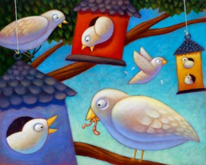
early birds Now that I have posted this pic of bi

Cover Art for Storywoks Magazine

Art (slash) Illustration for a Magazine Cover

Magic carpet ride over bookish buildings

magic carpet

Kids having fun with a reading theme

I was excited to take this job. I was happy to draw and illustrate this fun assignment: “Kids having fun with a reading theme”. It was a lot of fun to come up with the whimsical idea of a kid all freaking out on this wild magic carpet ride while his dog is hanging on like a pit bull and he little sister, or brother, not at all afraid of the potential danger all around, just curled up with a good book and having a great time.

My transition to digital phase

This was done during my “transition to digital” phase. I started my transition by saving time just going into Photoshop to crank out a quick back ground. Just spray in a gradient and print it out on good paper and vuala! Most of the boring part done. So this piece was a little painful because I produced it 100% in acrylics. Not because the client wanted it in acrylics. Not because I had more time to kill, but because my printer has finally given up trying to please me. We are no longer friends and I have banished it to the garage….And then we moved, and I hope that hateful printer is still in that garage thinking it will still have a life someday, and wondering why I haven’t come and apologized and plugged him back in. Sense any hostility?

100% ACRYLIC PAINTING ON PAPER, THE OLD FASHIONED WAY.

So it was back to my old fashioned way of painting with acrylics. Tone the paper and painstakingly dry brush a gradient back ground and then finally get to the painting. Eventually, even that became too painstaking for me, and I have pretty well converted to 100% digi. (That is short for digital, I think) Ho the dread learning curve. Now I’m happy I made the switch. lol :)

Climbing the Corporate Ladder

Editorial Piece about Women Climbing the Corporate Ladder

editorial illustration from over a decade ago

Originally printed for Hispanic Magazine.
corporate ladder

One of my oldies that I painted the old fashioned way with real acrylic paint and real brushes. Now days I do most of my artwork using pixels. Digital art work is just faster and… well you’ve heard me say it before and you’ll hear it again. I am not dissing on traditional painting, in fact I love the real stuff. And I encourage every artist to learn to manipulate real pigment.

LOOKING BACK

Looking at this takes me back. If you’ll notice, I would paint or tone the canvas or paper, with a rather dark color, and then paint lighter colors on top and slowly build up the painting with a very dry brush. Leaving a lot of the toned background to show through. In a nutshell, that is my acrylic painting style.

Editorial Illustration: Time

So I Illustrated the word: Time

I’m pulling this from the dark corners of my archive
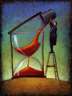
Back when I did a lot of editorial work I created this. It reared its acrylic head again a few years back when I pulled it out of the flat file and entered it in an Illustration Friday deal for the word time. And now it shows up one more TIME.

Just wanted to post something a little different. It’s about time, don’t ya think?  : )