Homework for Painting Color & Light
Here is a little assignment you can do, or not, but if you would like to, take the challenge and see what you come up with.
I would love to see what you come up with and maybe blog some of it. If you do something pretty cool, attach it to
me in and email. Well, don’t attach it
to me, attach it to an email and email it to me to my personal email.
WayneAndreason@Gmail dot com
Art Contest
(I just got an idea forming in my brain, this is now an art contest or a painting contest, or maybe a coloring contest, either way, see below, or the bottom, or the end of this blog for details.)
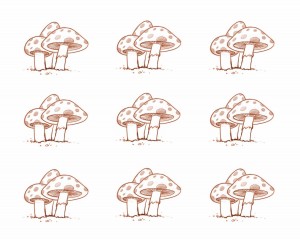
Just Color These
If you can figure out how to download these drawings, or save them to your computer or device, print if you wish to paint
traditionally, or work
digitally if you’d rather. Or do your best to draw them.
Variations of a theme.

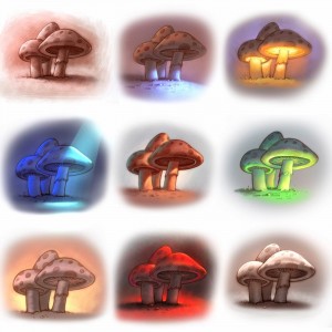
Take these mushrooms and make set different. That is, color them different colors, explore different light, colors and what ever. We have an example at the end of this blog if you want to see some possibilities.
Complex things are made of basic shapes

Bare in mind, that most things are built with
basic shapes, so this is simplified. Take it and decide what you will do with it. Light source and direction. Warm light, or cold, dark and dingy or light and cheery, you decide, add detail if you like.
Santa Claus (AKA Father x-mas) on a Tropical Island

So Santa is on the beach. See what you can do with
color on this one. Is it morning, is it noon day, is it evening, morning, or night? You decide. Do one in the day and one in the night if you dare. Same scene but Night vs Day.
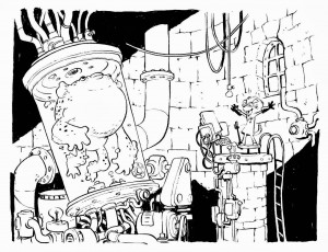
Mad Scientist in his Laboratory

This is an awesome black and white that Jake Parker drew during his Inktober phase last year. This could be realy fun to color, heck it’s fun just the way it is. Think of what you could do with color. You could use harsh light, contrasted by soft light, maybe some creepy fog. Have fun with it. This should be fun for
comic book and graphic novel lovers.
and this is “below, the bottom, and the end of this blog”
contest details:
Entries must be emailed to me WayneAndreason@gmail dot com (that’s code, figure it out, the dot means period and there are no spaces) as an attachment in the form of JPEG, no later than one week from today, Okay, 8 days, take Sunday off and go to church for a change. (this was an attempt at humor, please don’t take offence, I can only be so PC)
We will find some artists in the community to judge the artwork who will choose 1 to 4 winners, depending on how many entries we get. Or maybe I should say 0 to 4 winners as we may not get any entries.
By entering a piece or more, you are giving permission for that piece to be displayed on the internet etc. Just in case.
The winner/winners will get a FREE Folio Academy art lesson course of their choice.
Contestants are not allowed to EVER be offended by Will’s or my attempt at humor. We mean no harm, except to that girl named Tammy who tore up a picture I drew of a dinosaur back in second grade. I do mean to offend her but she can still enter. I promise I won’t tear it up. I think her last name was Roundy.
and oh yeah, you can’t go around selling it as your own work as the drawings are drawn by Will Terry
and Jake Parker who are famous artists and hold copyrights.
have fun.
EXAMPLE: COLORED MUSHROOMS
So we took the mushroom theme and ran with it to give you and example of what you could do.

PS if you know Tammy Roundy that went to Lincoln Elementary school in Salt Lake City about 45 years ago, tell her to friend me on FB. Any of you may friend me too. thanks. Your best friend, Wayne https://www.facebook.com/wayne.andreason
