Art Demonstration for an illustration Class at BYU
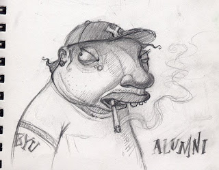
I may offend them with a BYU alumni overweight, and smoking!
Behold! the sketch I came up with. Fun? Offensive? Art?
 I really like this sketch and I’m going to paint it but I’m concerned that the student’s might not like that I’ve decided to portray a BYU alumni overweight. And as many of you know, they don’t smoke, so I am taking a little risk here. Not to worry, they may be Mormons but they aren’t that uptight.
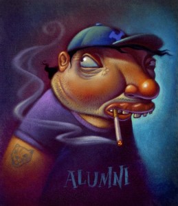
Finished, Acrylic paint over Photoshop printed background.
Six hours to paint it
 This is the finish art demo: It was a lot of fun working on it and talking to students. I was happy that they thought it was funny… or at least, didn’t beat me up for poking fun. I worked on it in class for about 4 hours and spent an additional 2 at home with a few finishing touches.
Digital Stage, no lighter than 50% value.
 This is the beginnings of my digital stage where I Scan in my sketch, take that into Photoshop and airbrush some smooth, basic colors and keep them kind of dark. My main concern is getting everything no lighter than about 50% value.
Using Photoshop I spent about 20 minutes laying in shadows and basic foundation colors. Then I printed it on watercolor paper. The next step in this method was to stipple a layer of acrylic gel medium over the print. I use a kind of short hair paint brush and a little Gel Medium at a time and stipple it onto the paper, giving it millions of little tiny peaks. Aka tooth. The gel drys clear so you can paint with acrylics right over it. Building up the lighter areas. And of course saving the highlights for last.
