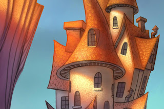
Warm Light, Cool Shadows add to a beautiful Contrast
I painted this as a demo for my digital painting class this semester at UVU. I really wanted to play around with a dramatic lighting situation.
Get inspiration from the real world.
One of the reasons I’m a big advocate of getting out there and seeing the world with your own eyes is the feeling you get and the inspiration to find a place for it in your work. I woke up to this last year in Utah’s Goblin Valley last year Needless to say, I was inspired. – my tent was about 5 feet to the right.
So this is how I begin my sketches on my iPad.
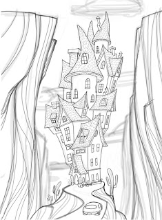
I call this the ugly stage. I’m basically making a “map” for me to trace and perfect on another layer. At this point I don’t care about detail – just the raw elements and proportions. It’s sketchy and loose but it will serve as my guide.
Use “Procreate” for a larger file size, plus you can rotate your “paper”
I’m using “Procreate” now because I can have a much larger file size then “Brushes” – AND – I can rotate the “paper”. That’s a huge improvement. Down side: (why is there always a downside?) It’s much slower than brushes. I’ll be making an update video for my “Painting on the iPad” video tutorial that demonstrates how you can use Procreate for your workflow.
And this is the perfected sketch. I probably used about three more layers to get to this point reducing the brush size and increasing the value of my lines.
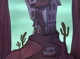
I think it’s really neat to look at this part of the painting because it looks so dark and different than the part in the sunlight…similar to the photo I took. I added the color in Photoshop CS5.
I love light and shadow.
You really can’t have one without the other can you? I really like exploring with cool colors vs warm colors to see what interesting blends happen and the mood it creates.


