Digital Painting, Illustrate in Photoshop

This, How to create Digital art, Painting in Photoshop got things going.

Digital painting in Photoshop. Art lesson by Will Terry


The digital transition was hard for me. But worth it.

Back in the day, I had such a great response to my “How to Illustrate Children’s Books” video series that I decided to make another series that explains in detail how I paint with digital paint in Photoshop. I had many requests over a number of years. to actually make a tutorial on painting in acrylic but I never got around to it. Well not at the time, so about a five years ago I was introduced to digital painting by Jed Henry – he was young illustration graduate and promising new upstart (He’d already sold two books to major New York Publishers. His generosity in helping me learn how to re-create my acrylic style digitally will never be forgotten! So I’m glad to report that I finally got around to doing a tutorial in acrylic painting the old fashioned way too. It was tough because I am so converted to digital illustration now.

Before Folio Academy I was Teaching Illustration at a University.

I was teaching at UVU, AKA Utah Valley University, and BYU. I wanted to show some technique on video so my students could log into a demo at their leisure. When the first one was such a success I decided that my peeps may want this one too. Little by little, my best friend Wayne and I created FolioAcademy.com.

Any who…

In this video series I go from sketch to finish, describing processes like: making and importing a texture, under-painting, value, brushes, layering, design, and many other aspects of coming up with your own personal way of thinking and working. If you want to know how I paint from start to finish you might be interested in these videos.

Just to be clear – these videos are not a general “How To” in Photoshop but rather a “How Will Terry fumbles his way into a digital painting with a very limited knowledge of Photoshop” In other words you could say these are Photoshop videos for dummies like me. I try to use as few tools as possible because part of my philosophy is simplicity and reduction lead to purity and essence.

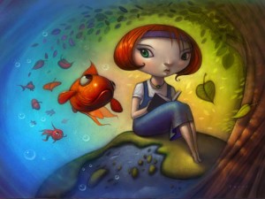
Above is the digital painting that I start and finish in the videos so if you hate that painting DON’T BUY THE VIDEOS! :) Click here to purchase the video.

an Artist’s 6 Steps to Illustrate a Concept

How would you Illustrate, Early?

If you were given a “carte blanche” assignment to illustrate the word, EARLY, what would you come up with. They say that if you give a thousand people the same task, they would come up with a thousand different ways to do that task. I would say that the same thing goes for ARTISTS. If you give a thousand artists the same assignment, (i.e. word or phrase to illustrate) you would get a thousand different ideas and portrayals.

Most illustrators use a step by step process

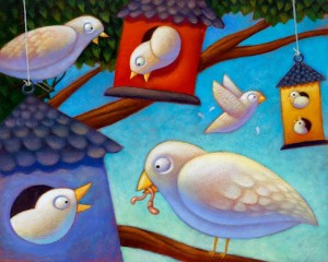
early birds Now that I have posted this pic of bi

Phases of this Textbook Cover Illustration

My Art Process for the Phases of this Cover Illustration

The Sketch

Element hired me to do the cover art for an English language text book.

– the idea is that by learning English you become more free to pursue whatever you want.
– that more doors are open to those who speak and understand English. And probable to those who know how to read and write English as well.
My client wanted me to illustrate some of the buildings in the shape of letters to further the language angle.

SEPARATE BACKGROUND Can be Used Multiple Times

I was asked to paint the background separate from the foreground so they can use it for other covers that we are currently working on.

Adding ELEMENTS

This is a challenge because as I’m painting it’s hard to control values and colors but here they are combined.

Final Cover Art

This is the final illustration, by me, Will Terry, with the cover graphics. Turned out pretty well.

Painting with Cool and Warm Colors

Warm Light, Cool Shadows add to a beautiful Contrast

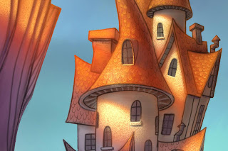
a Will Terry Digital Painting of House type Castle

I painted this as a demo for my digital painting class this semester at UVU. I really wanted to play around with a dramatic lighting situation.

Photograph of Red Rock cliffs with Harsh Light and Shadow.

Get inspiration from the real world.

One of the reasons I’m a big advocate of getting out there and seeing the world with your own eyes is the feeling you get and the inspiration to find a place for it in your work. I woke up to this last year in Utah’s Goblin Valley last year Needless to say, I was inspired.  – my tent was about 5 feet to the right.

Rough Sketch of House/Castle on iPad

So this is how I begin my sketches on my iPad.

I call this the ugly stage. I’m basically making a “map” for me to trace and perfect on another layer. At this point I don’t care about detail – just the raw elements and proportions. It’s sketchy and loose but it will serve as my guide.

Pic of ProCreate Logo

Use “Procreate” for a larger file size, plus you can rotate your “paper”

I’m using “Procreate” now because I can have a much larger file size then “Brushes”  – AND – I can rotate the “paper”. That’s a huge improvement. Down side: (why is there always a downside?) It’s much slower than brushes. I’ll be making an update video for my “Painting on the iPad” video tutorial that demonstrates how you can use Procreate for your workflow.

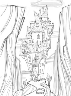
drawing of House/Castle

And this is the perfected sketch. I probably used about three more layers to get to this point reducing the brush size and increasing the value of my lines.

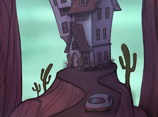
House/castle digital painting in process

I think it’s really neat to look at this part of the painting because it looks so dark and different than the part in the sunlight…similar to the photo I took. I added the color in Photoshop CS5.

digital paining of House/Castle in process

I love light and shadow.

You really can’t have one without the other can you? I really like exploring with cool colors vs warm colors to see what interesting blends happen and the mood it creates.