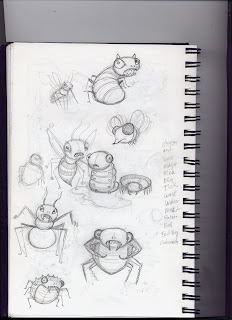
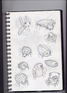
Back when I was designing characters for Nasty Bugs.
A page or two from my sketch book


Nasty Bugs, by Lee Bennett Hopkins (Author) , Will Terry (Illustrator)


Back in my editorial days I was always coached to send in multiple sketches and ideas for the art director to choose from. Now that I’m a children’s book illustrator I’ve come to realize that sending in multiple sketches for one page is not often the best policy. The reason: I always like one better than the other(s) and often the editor or art director will pick the one I like the least. Now it’s a let down having to paint an image I’m not as happy with.
I just created the image above for a new book I’m working on “There Once Was a Cowpoke who Swallowed an Ant” by Helen Ketteman (Albert Whitman). My working process is to send in rough sketches for the direction I’m thinking of. Then I get feedback from the art director and editor. My goal is to make myself happy and then see if the team likes it. If they do then I move to a final drawing refining details and making any alterations asked for by the team.
Sometimes they don’t like the direction at all and ask for a new idea -offering their suggestions. I love working this way. I’ve taken the time to explore many thumbnail sketches and ideas and I don’t want to share my rejected ideas just to offer more choice. Sometimes more choice just offers more confusion. Ever tried to order at restaurant with 100 menu items? You feel overwhelmed and start to think you’re going to miss something really good – so you spend more time reading the menu rather than visiting with the people you went to have a meal with.
I’m a big believer in working hard to develop a sketch you can’t wait to paint and then working with it until you and your team come to a consensus. I’ve taken the time to do a lot of editing in my development process and I choose NOT to share that with the creative team at the publisher.