How to Make an App – Step 4

How To Make A Story App – Step 4

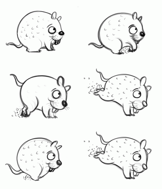
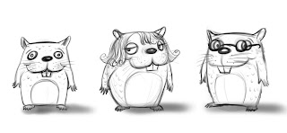
Work on character sketches, Interior sketches, and animations.

If you’re new to this blog you might want to scroll down to see my first steps

Keep in mind that I’m making this up as I go

– I really don’t know what I’m doing but I’m going about this as systematically as possible. And the others here at Folio Academy are still letting me so there you go. I’m using my experience from illustrating children’s books to guide my process but apps are a whole new beast so we’ll see if this works out. Right now I have the entire app sketched out and am checking all of my animations to make sure they work and communicate.

What should you NOT animate?

The hard part was figuring out what to animate but more importantly what NOT to animate. I really want this app to be able to do more than a book but I don’t want to get into full blown animation. I like the idea of page breaks to let the reader fill in the missing visuals with their mind – so not getting caught up in time consuming non-important animation is key to making my self imposed deadline and keeping my sanity, or what’s left of it.

But what if you’re not an animator?

Good Question, I’m NO animator – This is my first time. I’m taking a serious crack at it so I don’t want to bite off more than I can chew either. The little guy above is my main character and I’ll be able to re-use this animation over and over in my story. Of course I still have to paint him so my work isn’t finished but you can see that even an old illustrator can learn a few new tricks

Where can I learn more about creating my own apps?

Glad you asked.

– I made a video tutorial on how to prepare this kind of artwork for a story app here.

Alex Sousa is going to show us how to make these kinds of animations work in Kwik in our upcoming class that begins in a few weeks. We still have a handful of slots left for the live class but many are opting for the LITE, or video recordings of our class.

Check back October 4, 2013 for step -5.

HOW MANY SKETCHES SHOULD YOU SEND IN?

How Many Sketches Should You Send In?


Back in my editorial days I was always coached to send in multiple sketches and ideas for the art director to choose from. Now that I’m a children’s book illustrator I’ve come to realize that sending in multiple sketches for one page is not often the best policy. The reason: I always like one better than the other(s) and often the editor or art director will pick the one I like the least. Now it’s a let down having to paint an image I’m not as happy with.

I just created the image above for a new book I’m working on “There Once Was a Cowpoke who Swallowed an Ant” by Helen Ketteman (Albert Whitman). My working process is to send in rough sketches for the direction I’m thinking of. Then I get feedback from the art director and editor. My goal is to make myself happy and then see if the team likes it. If they do then I move to a final drawing refining details and making any alterations asked for by the team.


Sometimes they don’t like the direction at all and ask for a new idea -offering their suggestions. I love working this way. I’ve taken the time to explore many thumbnail sketches and ideas and I don’t want to share my rejected ideas just to offer more choice. Sometimes more choice just offers more confusion. Ever tried to order at restaurant with 100 menu items? You feel overwhelmed and start to think you’re going to miss something really good – so you spend more time reading the menu rather than visiting with the people you went to have a meal with.

I’m a big believer in working hard to develop a sketch you can’t wait to paint and then working with it until you and your team come to a consensus. I’ve taken the time to do a lot of editing in my development process and I choose NOT to share that with the creative team at the publisher.


Do I Need a Rep or Agent to Sell My Artwork?

Artist Will Terry specifically answers the big question,

Is it worth it to hire that Rep?

Agents and reps are struggling too right now.

Thanks to the internet, you are competing with a lot of other artists, but you are also allowed to, and can afford to compete with everyone.

Will Terry used to spend up to $7500 to advertise in one workbook, before the WWW in the mid 90’s.

Advice For illustrators

Will Terry answers more questions in this video

When we going out to lunch?

Tips on lighting.

How to value a rendering done by a student, are you bias?

How do you choose color for your color schemes?

Do I need a Rep?

What should I do to keep my skills sharp?

Style? How to find your style and should you stick to just one niche?

Is it a viable option to print my books on good paper and try that?

Will went through all the great questions that were after our last post and in this video he answer as best he can. Thank you for your great questions.

FolioAcademy is dedicated to help any who want it, become better artists.

I Draw, but How Can I Make Money With It?

Professional Artist, Will Terry Answers a few good questions.

In this video Will Terry of folioacademy, answers a question from David – a Southwest Airlines employee who has 3 days off/week and loves to draw comics during his down time. He actually made a video in-which he asked what steps he should take next to getting his work published. We figured that other artists too, might be in his situation and might benefit from some answers. Give it a look or just listen to this video, (there is audio) while you work or what ever.

Learn The Will Terry Acrylic Dry Brush Style

Learn The Will Terry Acrylic “Dry Brush” Style 

Here is a little acrylic sketch that FolioAcademy artist/instructor Will Terry did awhile ago. I was a fellow Art Student with him in college back when he was trying to find his niche and style. I remember him looking for a real toothy texture that would peal the paint off his brush. It took him years to master this style but it was worth it.

He eventually developed his own recipe for a painting. The ingredients include thumbnail sketches and getting the drawing designed just right and transferring that onto the paper.

Then getting the texture just right with a clear gel medium that would allow the drawing to show up perfectly.

He then tones the surface usually with a medium value color then adding dark paint where needed and then gradually, using a DRY brush and very little paint, he adds lighter and lighter acrylic paint. Light on Dark.

He teaches this process here at FolioAcademy.com, Just click on the link and purchase his tutorial.

Acrylic Painting by Will Terry

Acrylic Painting


Santa Pups Children’s Book Coming Soon

Children’s book Illustration in Progress

While FolioAcademy is my first priority, I also teach illustration at UVU and I am of course I am a freelance illustrator.
Presently I am working on Santa Pups by Jerry Pallatta – Scholastic.
Since it has all these dogs in it, I’ve been having a great time working on it -It’s a very simple but funny story where Santa decides to try different breeds of dogs to pull his sled one year. These are the Mutts and they want to go in every direction! This has been such a fun story to work on! I even got to work my dog Pooch into it! How did they know I’m such a dog guy? It’s like the dog gods were smiling down on me when I got this job! I even got to work the author and editor’s dogs into a few of the illustrations! Working as an illustrator is so much fun because you never know what kind of projects you’ll get to work on from month to month.
Pic of Pooch the dog and Will Terry, the artist. Will's face is photo shopped onto a dogs body.

I’m out of here – going for a walk with Pooch – later.

Phases of this Textbook Cover Illustration

My Art Process for the Phases of this Cover Illustration

The Sketch

Element hired me to do the cover art for an English language text book.

– the idea is that by learning English you become more free to pursue whatever you want.
– that more doors are open to those who speak and understand English. And probable to those who know how to read and write English as well.
My client wanted me to illustrate some of the buildings in the shape of letters to further the language angle.

SEPARATE BACKGROUND Can be Used Multiple Times

I was asked to paint the background separate from the foreground so they can use it for other covers that we are currently working on.

Adding ELEMENTS

This is a challenge because as I’m painting it’s hard to control values and colors but here they are combined.

Final Cover Art

This is the final illustration, by me, Will Terry, with the cover graphics. Turned out pretty well.

Why Visual Artist Don’t Learn as Fast as Musicians

Why We (Visual artists) Don’t Learn As Fast As Musicians

Will Terry blames the system for artists being so behind by the time they hit college.

If you’re enrolled in our “Illustration For Storytellers” class – FULL or LITE version please watch this video…it is designed to help all of us accept critiques easier.In this video I discuss why many visual artists in my University classes avoid my help, critiques, suggestions, and advice. I can’t blame them because they have been victimized by our public school system. I realize that I’m generalizing but most US students are never taught visual art the same way they are taught music, dance, acting, writing, and sports. We get our writing assignments handed back to us with red marks correcting our mistakes in elementary school all the way through high school. We have been conditioned to accept right and wrong ways to use the English language so when we get to college we begin at a much higher level for writing classes than do incoming freshmen in art.It’s important to understand how we have wrongly treated the visual art student so that we might help them understand that letting go of their bad habits will liberate them and accelerate their learning. I give many examples in the video – if you disagree with me please watch the video first where I make my complete argument – but I do welcome your thoughts! Thanks.
If you are ready to learn a little more, go to folioacademy.com for art lesson video courses online.

ONLINE CHILDREN’S ILLUSTRATION CLASS – SOLD OUT

Online Children’s Illustration Class – Update

Jake and I are so pleased that our FULL class has SOLD OUT – but we still have the LITE class available for $150. We are humbled to realize that artists all over the world trust us to share what we’ve learned about creating illustrations for stories like children’s books and comics. What is possible today wasn’t possible only a few years ago and it is my belief that we will find learning online more and more common in the coming years. I believe that is why FolioAcademy is doing so well. To think that we can broadcast from our little town in Utah USA to anywhere in the world is mind blowing and proves that if you work hard and dream BIG you can do it! The little map above shows how spread out our current enrollment is to date – but it’s still growing!

FAQ’s:

How long will I be able to purchase the LITE version of the class? We will keep the video only version of this class available until July 10th 2013- the last day of the LIVE class. If you want to watch all of these classes – get the details by clicking here.

What format will the LITE class be in? The LITE version of the class will be in an MP4 or WMV file or both.

If I buy the LITE class how long can I view it? If you purchase the LITE class you will be given a download link to have the complete video files on your computer for as long as you like.

Will I get any feedback with the LITE version? No – we produced two price points to account for the time we will spend with FULL version participants – the LITE class will deliver the recorded version of the FULL class without the critiques, class questions, draw-overs, and skype call.

What materials will I need for either the LITE or FULL class? The assignments we will give will all require drawing instruments like copy paper and pencils (or tablet with drawing program). Adding color to your assignment is optional. You could use Acrylic, Oil, Pastel, Watercolor, Gouche, Ink, or Digital. I advise my students to avoid colored pencil unless it’s mixed with an aqueous media like Watercolor because it takes a tremendous amount of time to build up color while controlling texture. Most illustrators avoid it as a stand alone medium for this reason.

If you have any other questions pertaining to the class I welcome them and will add them to this list if they are pertinent to participants.