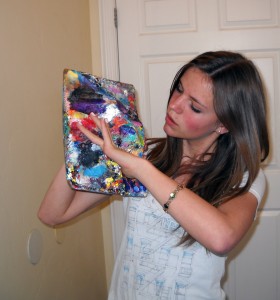
Mountains of Paint on a Pallet – Years of Buildup a Work of Art

Mountains of Paint: Artist’s Paint Pallet, a Work of Art

I seldom use my pallet or acrylic paints any more

palette (5)

Since I went mostly digital, I hardly ever use my brushes, my paper towels or even my beloved pallet. Beloved you say? Well, my pallet is like an abstract painting that is 20 years in the making. I still love painting in acrylic, it’s just that digital painting is so much easier and faster now. There is something to be said for traditional painting. The smell of oil, the finished work, paint on canvas is so timeless and original.
So I’m feeling bad because I just don’t add to this creation any more.
What started out as an insignificant piece of Masonite that I pulled out of the trash,
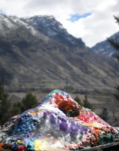
turned into this big thick clump of endless layers of acrylic paint.
layers of paint since 1990 
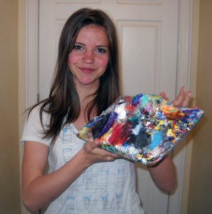
a painter's pallet, years of acrylic paint build up. Makes for a 3-D piece.So I was looking for something I could blog about and then it occurred to me – my pallet! This mound you see before you is constructed out of all of the acrylic paint I’ve used since 1990! It started out as my friend Wayne’s Masonite oil pallet. Wayne thought his pallet was too big so he cut it in half and tossed my half (the piece you see) in the trash. Way back then it was just a flat piece of 1/4 inch board. When I pulled it out of the trash and started using it as my acrylic pallet it began to grow.


Don’t Throw it Away! It’s got Character.

palette (9)


There was a time when I was going to discard it – it was growing out of control and I thought it would be easier to work on a new one. In fact I did carve some off a few times. But then I looked at it again – all bumpy, colorful and lumpy, Full of character and personality, We’d been through a lot together. “There there lil’ fella, don’t you worry – daddy isn’t going to abandon you like Wayne did.” (can you tell it’s 2:00 AM?)


He’s been around too

palette (10)So here he is – I figure he’s probably middle aged like me – lots of miles, like me and many more ahead, like me, (I hope). He’s been to Maryland, California, technically Nevada and Idaho, but mostly he’s lived here in Utah. Of the thousands of paintings I’ve done he’s got parts of all of them in him.
 I think I’ll name him Benjamin since I never had any run-ins with anyone named Benjamin.

There is an arch in there

palette (6)Oh, and that arch you see was at the request of my children constantly nagging me to sculpt some form into him – It took about 9 months to build the arch. Sometimes you just gotta ask yourself, “What would Dr. Seuss do?” I think his pallet would look a lot like Benjamin.

B&W Scratch Board Fish: Another Demo

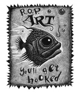
Scratch Board Artwork of a Fish.

Another piece that never saw the lght light

So I did a demo, again, and I ended up, again, with a piece of artwork that gets no fame, no glory. Kinda like doing assignments for school or for yourself if you are self teaching. Those precious works of art that sit forever in your portfolio or in a flat file. Or maybe, just maybe, your mom still has room on her fridge for some of you little gems.

I’m posting this Demo I Did awhile ago, then back to storage

FISH HOOKED
I’ve been busy plus I’ve been working with Folio Academy and with a few projects for hire. I’m not allowed to post the work from the projects because my clients don’t want them visible before their products release. So I decided to start from scratch. (pun intended) So I dug this out – a scratch board I did a few years ago for my R.O.P. art class in California. I liked the piece but it never saw the light of day – it was a demo. The class loved it. I am their favorite scratch board artist and I’m not even a scratch board artist. Plus, this little guy finally gets to rear his scratchy little face.
There there my little fishy friend, like my little wizard friend, you finally get your 15 minutes.

Black and White Art Work is a Good Place to Learn Good Design

A good illustration should work well in black and white if it is going to work well in color. So whether you are working in black and white, or color, you want to design your drawing, work out the details. Work out your value patterns, and design. Mark Summers is a master of black and white and when he colors one of his Illustrations, it still reads very well because it works so well in black and white first.

My Favorite Scratch Board Artist is Mark Summers. 

Composers ~mark summers
I find scratch board art kind of tedious, Scratching away so little at a time. But for those who enjoy it, it could be realy enjoyable. I would like to see how Mark Summers works. His stuff kicks my butt. I guess what I’m saying is that if you really want to go scratch board, you  should look to Mark Summers, the Illustrator not the game show host. I am not sure if his just looks better nest to mine or if it is really that good. Nope, I can tell, his is really that good. He is quite a craftsman and he has found his niche. Look how he has orchestrated each line rather than just scratching haphazardly like it did. Sweet! Way to go Mr. Summers.

Are Artists Respected for their Skill Like Other Professionals?

 ARE YOU RESPECTED FOR YOUR ARTISTIC ABILITY?

I Don’t think Illustrators get the Respect they Deserve. 

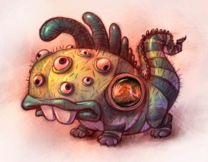
0005 Monster
What do doctors, lawyers, and CPA’s have in common aside from all that schooling? Probably the respect they get for their profession. Sure people often get a second opinion but they don’t go to the plumber – they go to another doctor, lawyer, or accountant.
I’ve wanted to write about this for a while because it irks me that in our profession we’re often not treated as the experts we’ve worked so hard to become. Let me begin by eliminating most of the children’s picture book editors from my upcoming rant. I’ve never been treated more like a professional than by my picture book editors. I’m talking about the clients we’ve had who don’t respect our schooling and work experience in freelance illustration. Do you ever feel trapped by your work? Hopefully this post will help you re-evaluate the people you choose to work for.

Death Design by Committee, Death of a good Illustration
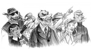
art by Brett Helquist

I find it really troublesome that we are often asked to make arbitrary, superfluous, unnecessary, and downright stupid changes that ruin the design and composition by clients that have no art training. It’s the equivalent of me telling my surgeon where and how to cut – my attorney what motions to file and my CPA what strategies he should use to save me money. Don’t get me wrong – I’m not talking about back and forth conversations about art direction and options to consider before beginning sketches – and I’m not talking about good feedback on sketches or final art. I’m talking about bone headed decisions like eliminating colors that the art director happens to personally dislike. I’m talking about cluttering up good design with extra elements that don’t enhance the story or eliminating elements that are important to visual literacy. I’m talking about making content changes based on fear and most importantly the all too familiar “design by committee approach”.

What is Design by Committee?

What is “design by committee” you ask? It’s when companies (often educational text book or software companies) have multiple team and management members that have to “sign off” or agree on all stages of the artwork before it can be approved and the artists are allowed to proceed. For instance, the illustrator receives the assignment and emails sketches to his/her art director. The one person who understands art and good design, the art director isn’t respected or trusted to make decisions and approvals either! The sketches must pass by each team members desk. This sets up a dicey situation for each team member as well. If a particular person in this chain likes everything he or she sees – he or she might feel that he or she isn’t doing his or her job by sending it through without changes. Since nobody in this donkey conga line wants to appear lazy they conjure up changes they often don’t believe in and punt to the next drone. Sometimes I find myself stifling the laughter listening to the poor art director trying to justify conflicting moronic changes that even he/she doesn’t believe in.
The result is a bunch of sketches sent back to the illustrator marked up like a failing high school research paper. I’ve gotten them back looking like college football play charts. It’s interesting to me that this hasn’t been my experience in the picture book world – and picture books cost tens of thousands of dollars more to produce than a few pages in a text book. With my picture book projects I get very thoughtful comments and requests that are sensitive to my intentions and desires. We work back and forth to find solutions that address concerns but it’s not dictatorial by nature and there certainly aren’t the sheer quantity of rage conjuring idiotic arbitrary “one for the gipper” comments.

Why Aren’t Artists Trusted for their abilities? 

What is it with art? Why aren’t our skills appreciated and trusted? Why do people think they can direct a painting when they don’t know how to design, draw, or paint? Why do people think they can publish without hiring skilled graphic designers? Graphic design is a science unto itself yet for some reason it seems to be a skill that is greatly under appreciated. I mean am I missing something? Do we hire college soccer coaches who have never played soccer? Do we hire conductors who have never studied music? Do customers go into the kitchen to tell the head chef how to cook the dish?
The answer can most likely be traced back to our schooling. Since it was never taught as a serious subject to all of us beginning in elementary school it is a discipline that is grossly misunderstood by the masses. “But Will, medicine, law, and accounting weren’t taught broadly either. Yes, but each of them have a level of mystery that are inherent to each discipline. Art on the other hand is very accessible. We see it for what it is. We can own it, touch it, commission it, clip it, steal it, share it, print it, etc. But does access devalue it’s creative process? Apparently so to some. (sarcasm intended)
Lately I have been listening to my client incompetence radar and turning down assignments that smell of the aforementioned disrespect. I love working on a good project with a great art director, editor, creative director, etc. – but life is too short to spend bitterly and angrily working with people who don’t value what I bring to the table.

What Can We Do?

If you’re serious about this business you can do a few things to help yourself and your fellow illustrators. If you find yourself in a situation like I’ve mentioned you can be respectful and politely challenge decisions if they are contrary to your artistic sensibilities. Don’t challenge for the sake of the challenge and when you do challenge – be solution oriented. Try to get what you want by offering another option that achieves what your art director wants while giving you more of a change you can live with. Agree to making some changes that you don’t agree with to help you win a few of the the more important battles. The better we are at communication – the better clients we will ultimately share.
Gallery artist vs Illustrator? Though I could be a Gallery Artist. LOL

Should I do fine art for a gallery, or Illustrate?

I painted this thinking I wanted to do Gallery work

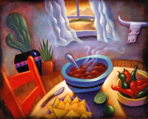
South Western DInner


Oh the glamour and prestige of being a fine artist 

This was a painting I did when I thought it would be fun, exciting, Okay glamorous,  to sell fine art in a gallery… Don’t we all just want to just paint for fun and hang our stuff in galleries all over the world and just kick back and sign autographs and check the mail box for money every day.

Now accepting offers from galleries for my art- Lol

So I had this south western idea and my own little style. I was creating my niche. Don’t poke fun of the perspective, “I did that on purpose”. (art speak) I painted this and really enjoyed doing it. No deadline, no art director, just me and the paint, and my dog Poochy bugging my to scratch her neck and go for a walk.

walk with Poochy

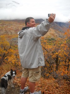
Here’s Poochy, and me, in the boardroom.

Then I realized that finding a gallery that wanted my work was going to be a stretch… and I would have to frame everything on my dime… and then there’s shipping… and wearing an earring… and a black turtleneck sweater… and growing a ponytail… and pretending to be be tortured … and I would have to smoke peyote… and go vegan… and lose weight… plus I couldn’t think of anything else I really wanted to paint… then I was glad I had an illustration career… and I scratched Poochy’s neck and took a walk.

Life is wonderful :)

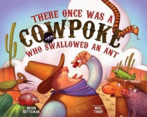
There Once was a Cowpoke who Swallowed an Ant: A Picture Book

Children’s Book Writer, Helen Ketteman & Artist, Will Terry Team Up Once again

Yet another wonderful picture book for all ages, especially children.

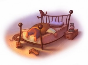
0002 Cow poke 1

I don’t care how many children’s books you’ve illustrated it’s always exciting to get that box of new books from the UPS guy – who I gave a BIG hug to – it was awkward.
This book is now available at many retailers and it’s the the fourth book I’ve illustrated by Helen Ketteman (Published by Albert Whitman) What a sweet lady! I had the opportunity to get into a car wreck with her in Houston. We were in the same car when her friend (who was driving) got into a crash. Everyone was fine but it was really nice to see how she comforted her friend who was quite frazzled. You can really tell a lot about someone’s character when they’re under stress.

School teacher turned author. 

0002 Cow poke 2Helen is one of those school teachers turned author – dangerous! I think that’s why she writes such fun books that kids really seem to love. This one is just pure fun. I think there’s been a shift towards books that teach a moral or celebrate a historical event. This book is just fun. Is it ok that we let kids just be kids sometimes and have fun? I’m still a kid and I like to have a little fun once and a while…ok all the time.

0002 Cow poke 3

Anyway if you’re looking for a fun book that doesn’t teach a darn thing your children might like this one!Buy There Once Was a Cowpoke Who Swallowed An Ant


Kid’s choice; favorite book to have read to them

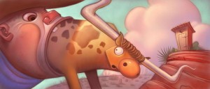
Cow poke swallowing a texas long horn steerI keep hearing kids say this is their favorite book to have read to them in March you can find it at amazon, and read it to a kid. 
Favorite place to lean art? At home on the computer.

Not All Illustrations Get to be in the Show

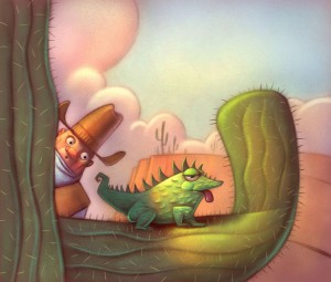
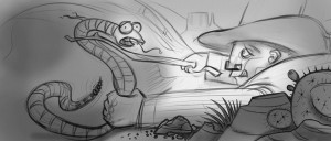
Cow poke 5 All that work, and then ‘no’, this little illustration is a still borne. It doesn’t get to live and breath and be a part of the book.
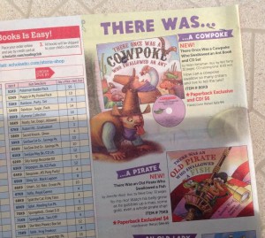
Hmmm… Wonder what I should order? 

It seems to be a lot of problems accidentally swallowing critters in children’s publishing these days…
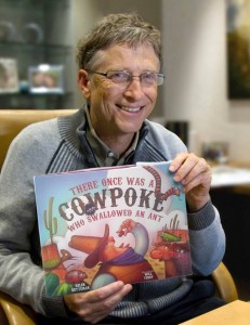
Wow, everyone likes this book. (Thanks to Photoshop)
Cow poke 6 Cow poke 7

Illustration Demo for BYU Art Students

Art Demonstration for an illustration Class at BYU

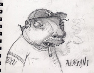
 I may offend them with a BYU alumni overweight, and smoking!

I was asked by Greg Newbold to do a demo in his illustration classes… so I racked my brain to come up with something that would be FUN but non-offensive to the students. Well not TOO offensive.

Behold! the sketch I came up with. Fun? Offensive? Art?

I really like this sketch and I’m going to paint it but I’m concerned that the student’s might not like that I’ve decided to portray a BYU alumni overweight. And as many of you know, they don’t smoke, so I am taking a little risk here. Not to worry, they may be Mormons but they aren’t that uptight.  :)

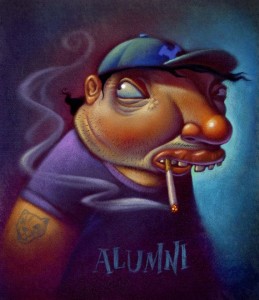
Finished, Acrylic paint over Photoshop printed background.

Six hours to paint it

BYU alumnusThis is the finish art demo: It was a lot of fun working on it and talking to students. I was happy that they thought it was funny… or at least, didn’t beat me up for poking fun. I worked on it in class for about 4 hours and spent an additional 2 at home with a few finishing touches.


Digital Stage, no lighter than 50% value.

This is the beginnings of my digital stage where I Scan in my sketch, take that into Photoshop and airbrush some smooth, basic colors and keep them kind of dark. My main concern is getting everything no lighter than about 50% value.

Using Photoshop I spent about 20 minutes laying in shadows and basic foundation colors. Then I printed it on watercolor paper. The next step in this method was to stipple a layer of acrylic gel medium over the print. I use a kind of short hair paint brush and a little Gel Medium at a time and stipple it onto the paper, giving it millions of little tiny peaks. Aka tooth. The gel drys clear so you can paint with acrylics right over it. Building up the lighter areas. And of course saving the highlights for last.


Cover Art for Storywoks Magazine

Art (slash) Illustration for a Magazine Cover

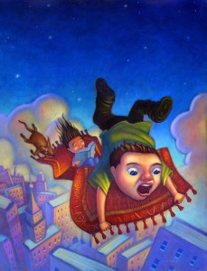
Magic carpet ride over bookish buildings

magic carpet

Kids having fun with a reading theme

I was excited to take this job. I was happy to draw and illustrate this fun assignment: “Kids having fun with a reading theme”. It was a lot of fun to come up with the whimsical idea of a kid all freaking out on this wild magic carpet ride while his dog is hanging on like a pit bull and he little sister, or brother, not at all afraid of the potential danger all around, just curled up with a good book and having a great time.

My transition to digital phase

This was done during my “transition to digital” phase. I started my transition by saving time just going into Photoshop to crank out a quick back ground. Just spray in a gradient and print it out on good paper and vuala! Most of the boring part done. So this piece was a little painful because I produced it 100% in acrylics. Not because the client wanted it in acrylics. Not because I had more time to kill, but because my printer has finally given up trying to please me. We are no longer friends and I have banished it to the garage….And then we moved, and I hope that hateful printer is still in that garage thinking it will still have a life someday, and wondering why I haven’t come and apologized and plugged him back in. Sense any hostility?

100% ACRYLIC PAINTING ON PAPER, THE OLD FASHIONED WAY.

So it was back to my old fashioned way of painting with acrylics. Tone the paper and painstakingly dry brush a gradient back ground and then finally get to the painting. Eventually, even that became too painstaking for me, and I have pretty well converted to 100% digi. (That is short for digital, I think) Ho the dread learning curve. Now I’m happy I made the switch. lol :)

Climbing the Corporate Ladder

Editorial Piece about Women Climbing the Corporate Ladder

editorial illustration from over a decade ago

Originally printed for Hispanic Magazine.
corporate ladder

One of my oldies that I painted the old fashioned way with real acrylic paint and real brushes. Now days I do most of my artwork using pixels. Digital art work is just faster and… well you’ve heard me say it before and you’ll hear it again. I am not dissing on traditional painting, in fact I love the real stuff. And I encourage every artist to learn to manipulate real pigment.

LOOKING BACK

Looking at this takes me back. If you’ll notice, I would paint or tone the canvas or paper, with a rather dark color, and then paint lighter colors on top and slowly build up the painting with a very dry brush. Leaving a lot of the toned background to show through. In a nutshell, that is my acrylic painting style.

Sold to the highest bidder! A Painting of a Mean Dog Chewing on a Little Cat

Art Auction: Acrylic Painting on Paper: Original Artwork

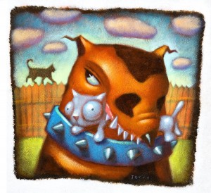
Neighbor’s cat ~Will Terry – Sold for $300

A dog with a little cat in its mouth
This is an image I did for a fund raiser for Reagan Academy School in Springville Utah awhile ago.
Stephen Pratt, the school art teacher suggested I call it “Neighbor’s Cat”, so I did and it auctioned for $300. Had I called it, Neighbor’s Dog, it may have sold for a lot less, or not at all.
It was a lot of fun to meet some of the other artists and catch up with friends.
This was done with card stock, gel medium and acrylic paint. And water.
Yes I sold it awhile ago, I am just finally now bragging about it. I am still convinced that I wouldn’t make it in the world of gallery art.

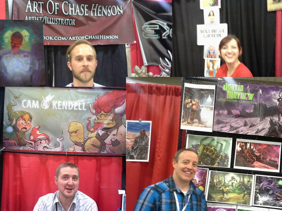
10 Things I Learned at SLC Comic Con 2014

Great for Artists/Illustrators, SLC Comic Conference 2014

Ten Things I learned at the SLC Comic Con last week, or so:

1. I was supposed to geek out on the famous firefly insect Adam Baldwin but I don’t like insects much.

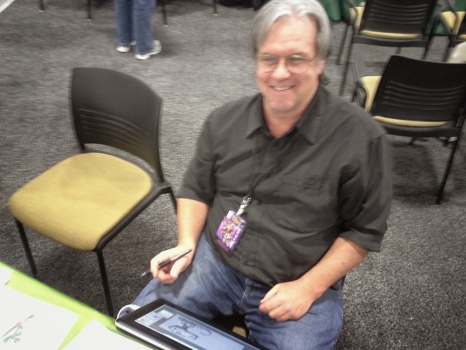
2. I take really good blurry pictures. Most people struggle with this technique – not I. Here is Corel Painter, artist, Don Seegmiller better known as Neil Young. Maybe I should take a Photography class at Folio Academy.

3. I enjoy meeting online friends in person like these Disney interactive artists; Mathew Armstrong and Jason Kim

4. Reconnecting with my blurry friends like Disney artist Ryan Wood.

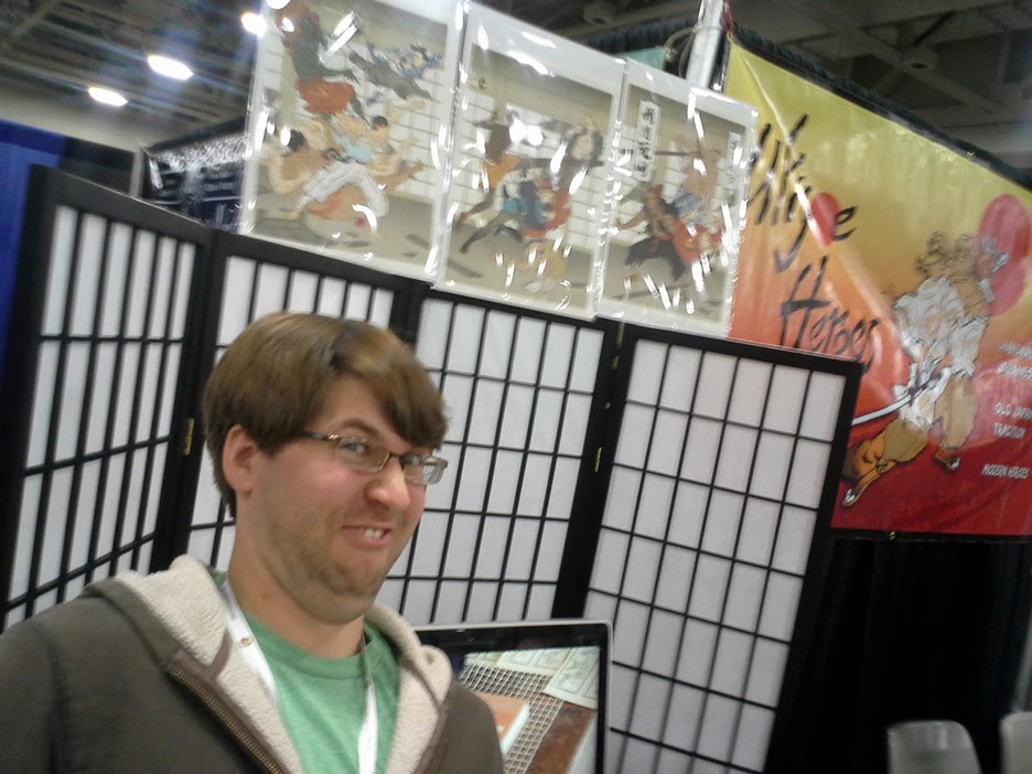
5. …and gopher turned Japanese poster artist Jed Henry (google Ukiyo-e Heroes)

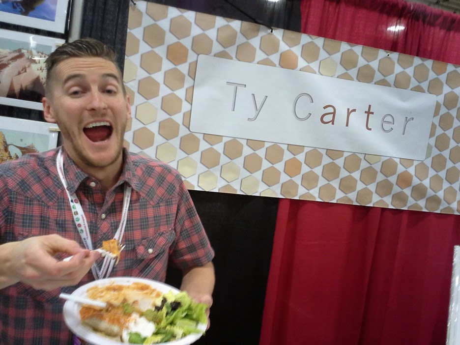
6. That Ty Carter is trying to bulk up for his next career as an MMA fighter…

7. …and Jake Parker is already an MMA fighter…so don’t disrespect.

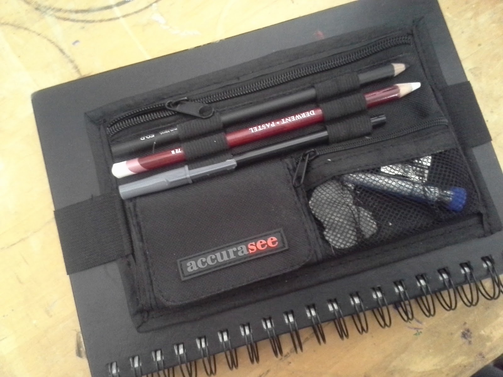
8. Oh – and that Bjorn Thorkelson created the “Accurasee sketch caddie” the BEST product I saw at comic con! It’s an art tools carrier that fits over the cover of your sketchbook. I was blown away by this nifty device. Many of you know that I mostly sketch on my iPad now but I had to have one of these for the times when I take my sketchbook out. I remember what a pain it was to try to carry everything I wanted – no longer! Check it out at his website.

9. That many of my students from UVU although blurry, have become amazing artists and will be forces to be reckoned with in animation, visual development, and illustration.

10. And finally that Jared Salmond has become completely invisible. People loved watching his pen sign all those posters. When I had him in class he was only “mostly” invisible but through hard work and determination he has finally arrived at his present form of, well, not being there….and for his next feat he will become mute.