Art, Painting, and Drawing Should be Fun

Art should be fun, so Draw or Paint something just for fun
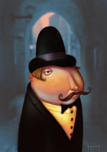
color sketch of a man, by Will Terry

A quick Color sketch I did Just to have some fun with my art

When you Make your money with Art, it can become a job

Art is my career and believe it or not, It gets boring, stressful and even difficult at times. OK a lot of times. It was so fun to draw and color, and take the heads of of Barbie dolls, as a child. And I was terrible at the three R-s, so I wanted to be and artist. But, little did I know, that when you are drawing, coloring, dealing with committees and art directors and other clients for 4-18 hours a day. (Deadlines can push you into overtime mode) It can get boring.

Don’t get me wrong, I still love being and artist, Art is my dream job and I feel very fortunate to be an artist. So there! All my teachers who discouraged me from being an artist. But some times you just need to sharpen the axe. Take it easy, and draw, paint, or sketch just for fun. Have fun! your an artist for crying out loud.
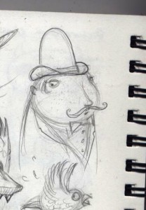
Pencil Sketch of a man with a mustache art by Will Terry

Black and white sketch of the art I did for fun

So I did some artwork just for fun

I decided to avoid working on the projects that pay real money and do something just for fun. I painted this in Photoshop last night sitting in our new recliner watching “The Thing” (1982 John Carpenter version) with my boys. I rendered it on my little netbook just to see how far I could take an image on that little $248 computer. Technology is getting really affordable for everyone.
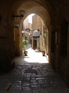
Italian scene with an arch, photo

Background I took to slap into the back ground of the sketch I painted.

So I’m a copy cat, This is my art, for me, for fun

I combined the background photo (google images) with my rendering to save time. FYI I would never do this for a paying client – I don’t like confrontations, threats, law suits, etc. I don’t condone Plagiarism, but we all copy.

What I’m saying here is, if you are doing some art just for fun, sketching, drawing painting, what ever, go ahead and do what you gotta do. Borrow, copy, look to the masters.  Art should be fun, once in a while if not always. Besides, you are practicing, learning, sharpening the saw. So copy away, learn and have fun. But don’t plagiarize, that’s when you steel someone else’s work and try to pass it off as your own. Where was I? Oh yeah, HAVE FUN!   :)


Digital Painting, Illustrate in Photoshop

This, How to create Digital art, Painting in Photoshop got things going.

Digital painting in Photoshop. Art lesson by Will Terry


The digital transition was hard for me. But worth it.

Back in the day, I had such a great response to my “How to Illustrate Children’s Books” video series that I decided to make another series that explains in detail how I paint with digital paint in Photoshop. I had many requests over a number of years. to actually make a tutorial on painting in acrylic but I never got around to it. Well not at the time, so about a five years ago I was introduced to digital painting by Jed Henry – he was young illustration graduate and promising new upstart (He’d already sold two books to major New York Publishers. His generosity in helping me learn how to re-create my acrylic style digitally will never be forgotten! So I’m glad to report that I finally got around to doing a tutorial in acrylic painting the old fashioned way too. It was tough because I am so converted to digital illustration now.

Before Folio Academy I was Teaching Illustration at a University.

I was teaching at UVU, AKA Utah Valley University, and BYU. I wanted to show some technique on video so my students could log into a demo at their leisure. When the first one was such a success I decided that my peeps may want this one too. Little by little, my best friend Wayne and I created FolioAcademy.com.

Any who…

In this video series I go from sketch to finish, describing processes like: making and importing a texture, under-painting, value, brushes, layering, design, and many other aspects of coming up with your own personal way of thinking and working. If you want to know how I paint from start to finish you might be interested in these videos.

Just to be clear – these videos are not a general “How To” in Photoshop but rather a “How Will Terry fumbles his way into a digital painting with a very limited knowledge of Photoshop” In other words you could say these are Photoshop videos for dummies like me. I try to use as few tools as possible because part of my philosophy is simplicity and reduction lead to purity and essence.

Above is the digital painting that I start and finish in the videos so if you hate that painting DON’T BUY THE VIDEOS! :) Click here to purchase the video.

A QUICK LITTLE DIGITAL PAINTING OVER A QUICK LITTLE PENCIL SKETCH

Two Hour Pencil Sketch, Painted in Photoshop

Folio boy will Terry draws in pencil & Paints in Photoshop.

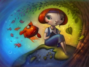
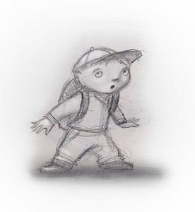
little Boy painted in Photoshop little Boy sketchSince I have been telling lately about my transition from acrylic to digital illustration, I thought I would post these little After and Before pictures ot a sketch I drew then painted in Photoshop. In the beginning I was able to get a handle on the digital painting a lot faster than digital sketching and designing the drawing. So I would do a basic drawing and then finish it in Photoshop. I also enjoy a lot of the play between the pencil drawing and the painting. I left a lot of the hatchy, sketchy, pencilly, lines shining through the paint, on purpose.

This little study took me just two hours to complete and was a lot of fun.


QUICK Tree House SKETCH Pencil & Photoshop

Pencil Sketch of a Tree House, Painted in Photoshop

Push yourself by giving yourself a time limit. 

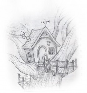
The world famous artist, Will Terry, (he’s famous in my world) sketched this little tree house during a really boring meeting. I know I know, all meetings are boring to Will. To me too. But this one was really boring. Lucky he had his sketch book.

tree House Sketch

He only gave himself a half hour paint it. 

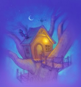
He liked the sketch and decided to scan it and paint it using Photoshop, but only gave himself a half hour to color it.
He wanted to push himself and see how far he could get in a short amount of time.
I feel it could look better, and would if he spent more time on it. But rules are rules. Sometimes it is a good exercise to push yourself by giving yourself a time limit.

Work the whole Illustration from general to specific

tree House 30 Mins. in PS

A lot of artists will work their illustrations from general to specific. When asked how they know when it is done, they might say. “It is done when it is due.” In other words they keep working on it, bringing the whole painting up to a finished point little by little. Working the whole thing from general to specific. So as they spend more time on it the whole piece gets more and more refined. Then when the dead line comes, turn it in, it’s done.
This tree house is still pretty general, but for some things it could almost pass as being finished.
It is time for this blog post to be finished so I…

Painting a Hobbit Home or Gnome Home in a Tree

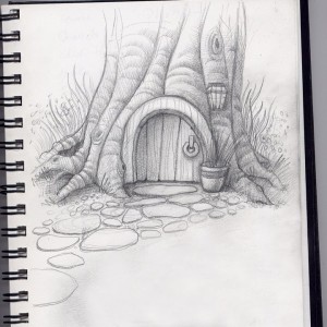
Pencil Sketch & Digital Painting of a Hobbit Home

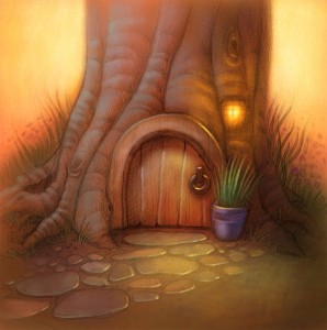
Before and After pictures of a hobbit home, sketched then painted in Photoshop

Gnome home, a door in a tree

Before

Here is a Before and after set of pictures of a basic drawing or sketch and what it looks like once it’s been scanned in and painted over via photo shop with the digital painting techniques taught in our beginning PS course, Painting in Photoshop and our Advanced Digi Painting in Photoshop art courses at FolioAcademy.com.


soft back light and the soft edges of the tree and background flowers

digital artwork of a Hobbit home or gnome home

After

I love the soft back light and the soft edges of the tree and background flowers. I like the porch light being on too, In real life I hate any of my lights left on when it’s not necessary, but it works well in paintings and photography. I also like the arbitrary almost, cool, light on the door and the stepping stones. They didn’t over due it with color either so the little violet pot and green plant just kind of pop. Note how the artist crisped up the lines and edges on the door and plant, to direct and focus our attention on the door knocker and the potted plant. The sketch above also has some of that soft line quality that was later used in the final piece.

You may also want to notice the cool colors in the very warm painting. Especially on the left side of the tree trunk. Warm light, cool shadows.  Nice huh?

Have a blessed day :)

I Found the PERFECT Stylus For Drawing and Painting on iPad – Procreate App

Finaly! The Perfect Stylus For Doing Your Art on iPad

ARtist, Will Terry used to use His finger to create art on his iPad

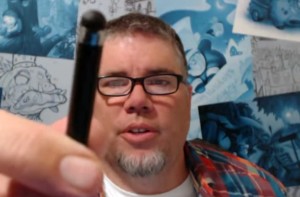
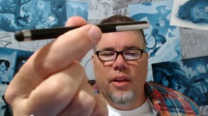
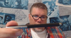
Will Terry displays his favorite stylus

I use a fat bulbous stylus

I have found the perfect stylus for drawing and painting and doing all that digital artwork on my iPad. Using a Procreate drawing app. I used to use my finger, in Photoshop and in Procreate. As you know, the best stylus is the one you have with you and you should always have your fingers, or at least one of your fingers with
you. I have changed my mind since I’v found this. See the pictures.

How can this bulbous pointed thing be a good stylus?

000 Stylus 02But when you draw with something blunt like this, you are less likely to get that into detail too soon. Like if you are painting, William Whitaker says you should go for the biggest brush you dare to use and then grab one a little bigger.
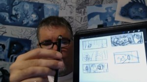
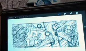
So with this bulbous, fat, blunt stylus, I just start drawing.

Artist Will Terry displays a few sketches on his iPad

See sketches there to the right.

I first come up with a few sketches, doing all my initial design for my images with the fat stylus right on my iPad or on my Cintiq monitor.


I turn my design into a composition.

Composition on an iPad

My Simple Composition

Just like when you paint in Photoshop, you want to start with huge clunky brushes. All the realy great Photoshop artists use a big brush in Photoshop.


Then Work the Composition into a Painting

Digital Painting by Will Terry

The comp there, became THIS Painting which I just finished on my cintiq monitor. You may remember it from a previous post. See it here on my Cintiq monitor as well.

000 Stylus 06So when you are painting, Start with a big brush and when you are painting digitally, start with a big stylus like the one I use now instead of my finger.


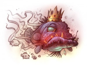
This Fish King Painting was done with the fat Stylus

King FishThis Fish King Painting was done with this stylus that I displayed above. You may remember it from a previous post.

You can spend over $100 on a stylus

I am asked here at FolioAcademy,  ALL THE TIME, Will, What stylus should I get? What is the best one for me? Which one are you using? Should I get the one that has a little plastic tip? Or one with pressure sensitivity or virtual pressure sensitivity. (I don’t know about that, because it may be for you if your painting style requires some of that, and that could be a good one).

OK it may not be the very best Stylus, but it’s the best for me. 

000 Stylus 08

OK I admit I said I found the best stylus but I have to admit that it may not be the best for you. It probably is, however, you may be light years ahead of me and using one of those artsy, schmancy, pressure sensitive, new fangled,  expensive, high falutin types.

For me, the $12.00, blunt tipped, stylus you can get at Target or the basic store. I think I spent $12.00 on mine. And if and when it wares out or gets lost, I am not out a whole lot of money.

 Paint and Draw from General to Specific, Digitally and Traditionally

So to recap, you should know this already but if you don’t, you should start rough, and work from general to specific. That was drilled into us at BYU by the Dean of the Illustration Department, Robert Barrett, and he was right. After you get your painting blocked in, or your drawing roughed in, then you can go in and start picking out, or putting in, the detail. So many paintings are ruined because the artist starts noodling it to death and working on detail when the basic shapes and design are still not worked out or defined. In a word, use a fat stylus.

I will post a demo next week of a sketch to a nearly finished piece.


Photoshop Speed Painting of a Damsel in a Tower

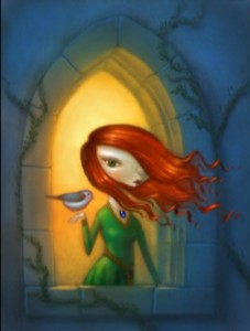
Fairy Tale, Digital SpeedPainting of a Beautiful Girl in a Tower

Video looks better with the right music

Damsil

This little speed painting is set to a Tori Amos tune that makes this little digital speed painting look a lot nicer. It’s funny how the audio can make the picture that much nicer. If you don’t know what I’m talking about, watch this again with out the sound. Notice when you are watching a movie trailer or preview, the sound makes you want to watch the movie. try watching a few previews with the sound off, you will see what your not hearing. It isn’t as pretty.

Painting (with Photoshop) Just for Because!!!

I love my work and I love the projects I’m working on but sometimes I get an urge to create something different and that feeling will gnaw at me until I stuff it with a free painting day.This was a sketch I did while in church (of course I was listening – shut up and just don’t ask what the sermon was about) and I thought it would be fun to record it and set it to music – I was right. I’ve always loved this Tori Amos song too and it makes the speed painting look a lot nicer. I’m still loving Photoshop… but it made me want a bigger, badder, meaner, stronger, faster, (six million dollar) computer… and a Cintique. Which by the way, I now have. And I am loving that too. And since it is for my (art) business, it’s tax deductible. (I am not a tax pro and this is not tax advice, please contact your tax professional for any tax deductions of which, you may be entitled. And there are a lot. I think) That being said, be self employed, it’s worth it, I guarantee it. (that is not a guarantee)

Your friend Will Terry of Folioacademy, art lessons online.

The Day of the Teacher: Poster by Will Terry

Speed Painting of the CTA Poster 

Will Terry was commissioned to design, and illustrate the poster.

Will was asked to design a drawing and render some art to celebrate California’s “Day of the Teacher” celebration. He decided to incorporate multiple career choices into the poster and to a city-scape type setting. He also uses color in his beautiful style so it is fun to look at and fun and entertaining to watch.

Here is the speed painting by the semi famous, Will Terry.  Give it a look, it’s only 3 minutes long and set to good music. He says he could play with these shapes all day. But lucky for us, he time-lapsed it so we can watch him in 3 minutes.

Thanks Will for recording this so we can all enjoy your work.


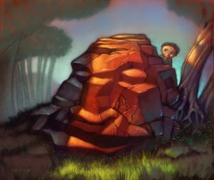
Head, Stone: Speed Painting in Photoshop

Things Happen When you Just Start Drawing

I was sketching in my sketchbook and this just kind of happened…

0008 prehistoric headstone

I hadn’t ever painted a pile of rocks before so of course I had to find out what it would look like in color. I say paint but of I used Photoshop. It still feels like acrylic painting to me. Then the next logical step was to make it into a video. I sent it to my sister Beth who said its boring, “make it cool or something, you need to make something move, it’s a video after all”. So I did, be sure to watch the end. And no, it doesn’t wink. (spoiler alert!) That is an inside joke for all those who actually watched my Giant speed painting video a week or two ago. Plus, a pile of rocks that looks like head, cool  huh? I have no idea what is buried beneath but it’s probably something way cool. I don’t know who the kid is either, probably someone way important – seriously – weird things happen when you just start drawing.

Photo shop speed painting, a quick demo of digital painting online

Illustration Demo for BYU Art Students

Art Demonstration for an illustration Class at BYU

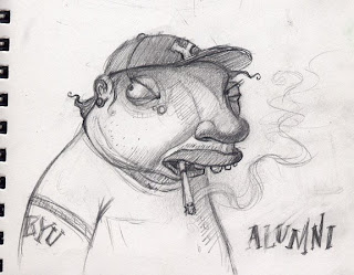
 I may offend them with a BYU alumni overweight, and smoking!

I was asked by Greg Newbold to do a demo in his illustration classes… so I racked my brain to come up with something that would be FUN but non-offensive to the students. Well not TOO offensive.

Behold! the sketch I came up with. Fun? Offensive? Art?

I really like this sketch and I’m going to paint it but I’m concerned that the student’s might not like that I’ve decided to portray a BYU alumni overweight. And as many of you know, they don’t smoke, so I am taking a little risk here. Not to worry, they may be Mormons but they aren’t that uptight.  :)

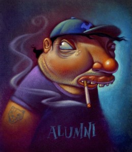
Finished, Acrylic paint over Photoshop printed background.

Six hours to paint it

BYU alumnusThis is the finish art demo: It was a lot of fun working on it and talking to students. I was happy that they thought it was funny… or at least, didn’t beat me up for poking fun. I worked on it in class for about 4 hours and spent an additional 2 at home with a few finishing touches.


Digital Stage, no lighter than 50% value.

This is the beginnings of my digital stage where I Scan in my sketch, take that into Photoshop and airbrush some smooth, basic colors and keep them kind of dark. My main concern is getting everything no lighter than about 50% value.

Using Photoshop I spent about 20 minutes laying in shadows and basic foundation colors. Then I printed it on watercolor paper. The next step in this method was to stipple a layer of acrylic gel medium over the print. I use a kind of short hair paint brush and a little Gel Medium at a time and stipple it onto the paper, giving it millions of little tiny peaks. Aka tooth. The gel drys clear so you can paint with acrylics right over it. Building up the lighter areas. And of course saving the highlights for last.